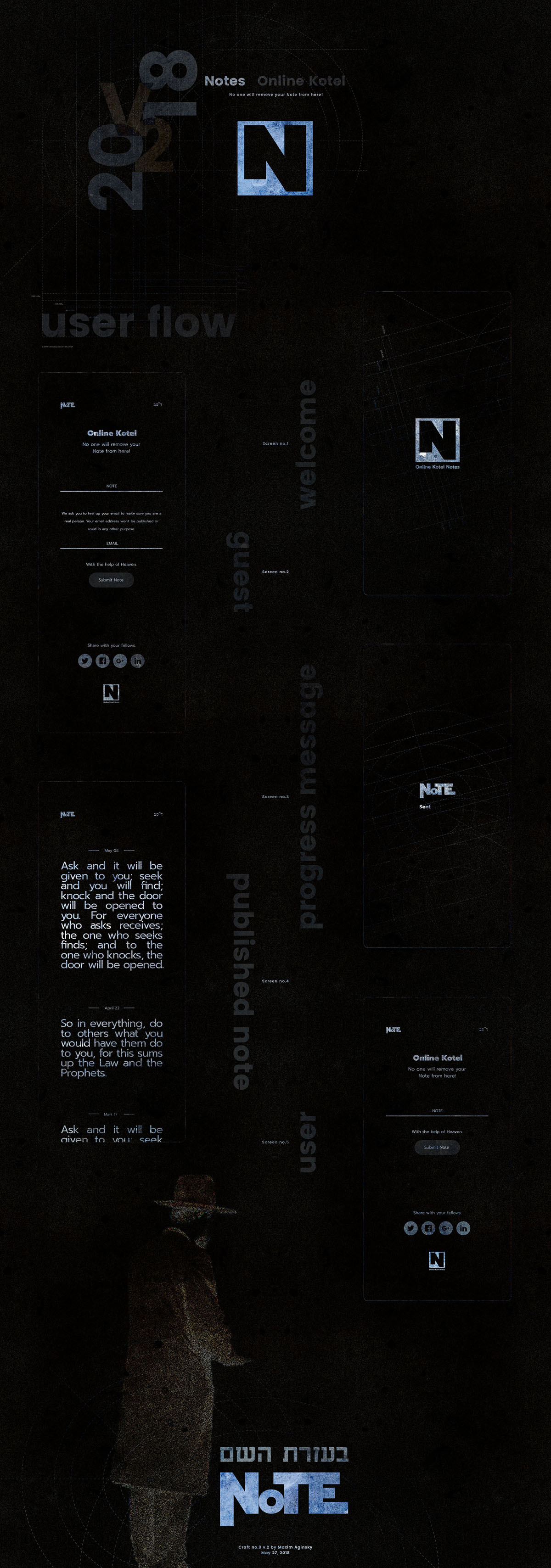
Dark user flow
Screens and identity elements on the dark background. A bit different angle of view.
Dark background texture evokes not the best associations. As far as I can tell, a website with such concept as Kotel Notes requires brighter motive.
- Drew
I agree, but: we ask for good, but do bad :) So the dark theme for such project is actually very realistic. The realism in the current case just not user friendly :)
- Maxim