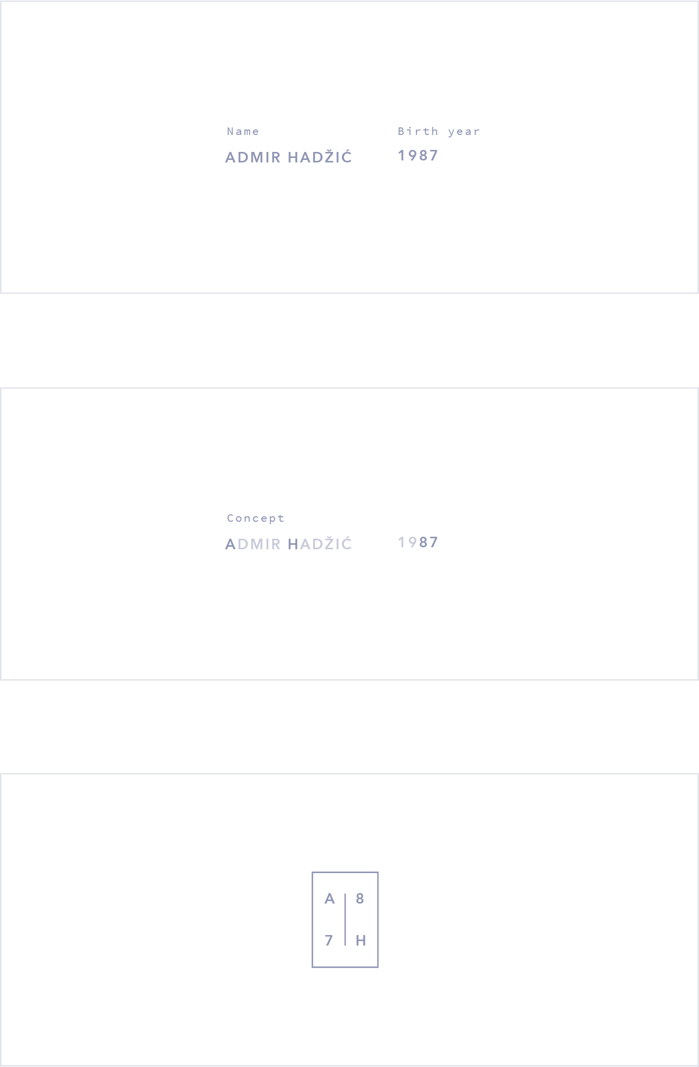
Admir Hadzic Portfolio
Intro
Hello there,
My name is Admir. I am a multi-disciplinary designer from Slovenia, currently working as a UX Engineer @ Google in Munich, Germany. Before I share the concept and idea behind my work I would like to take a moment and thank the team from Cssfox for this outstanding opportunity and for featuring and supporting my work.
Concept
Presenting myself and my work was always one of the toughest tasks I could think of. I truly believe that you can judge a person, their approach on solving problems and mindset through the design language used in their work. That powerful expression is exactly what I tried to convey and bring to the broader audience.
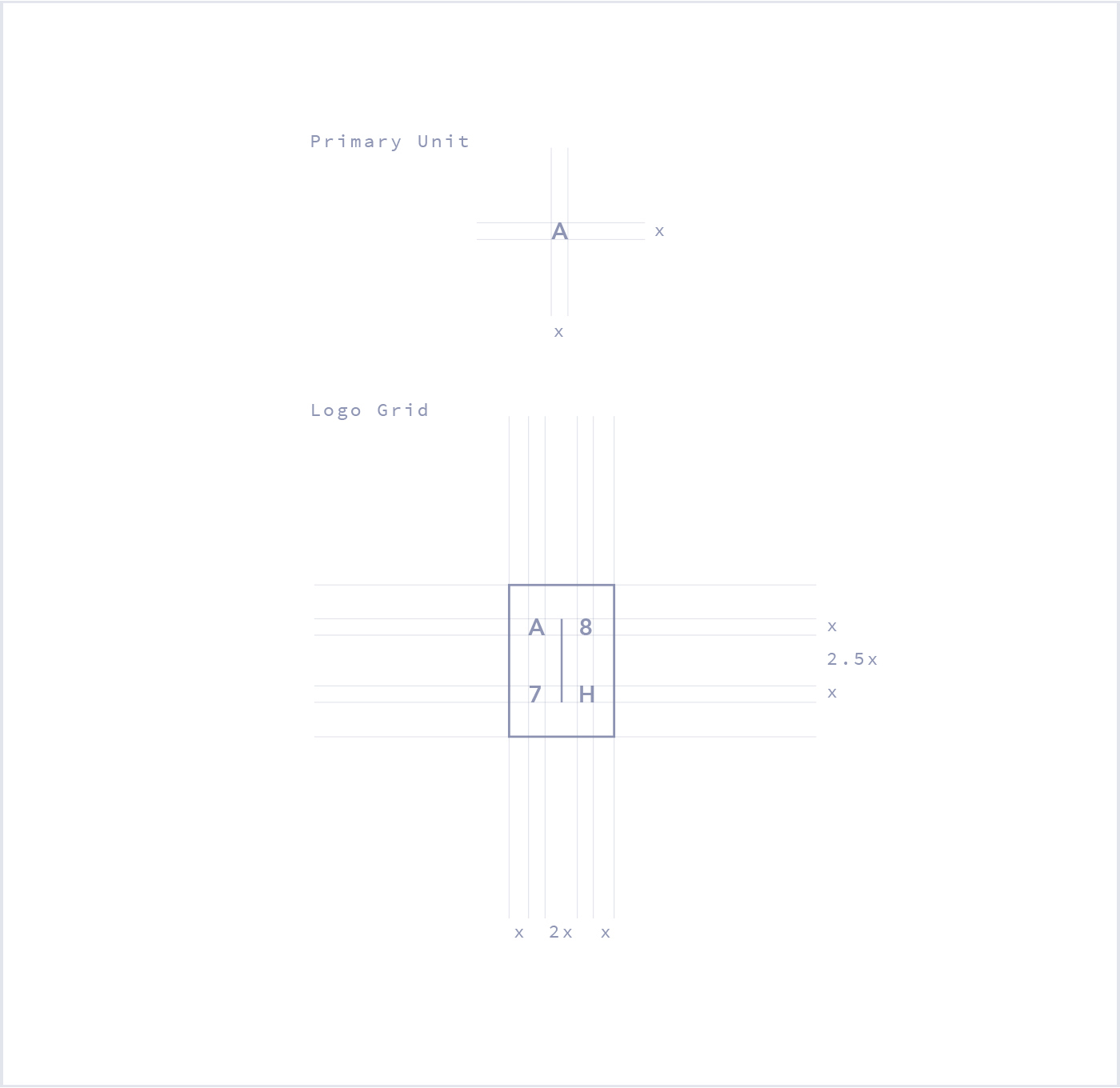
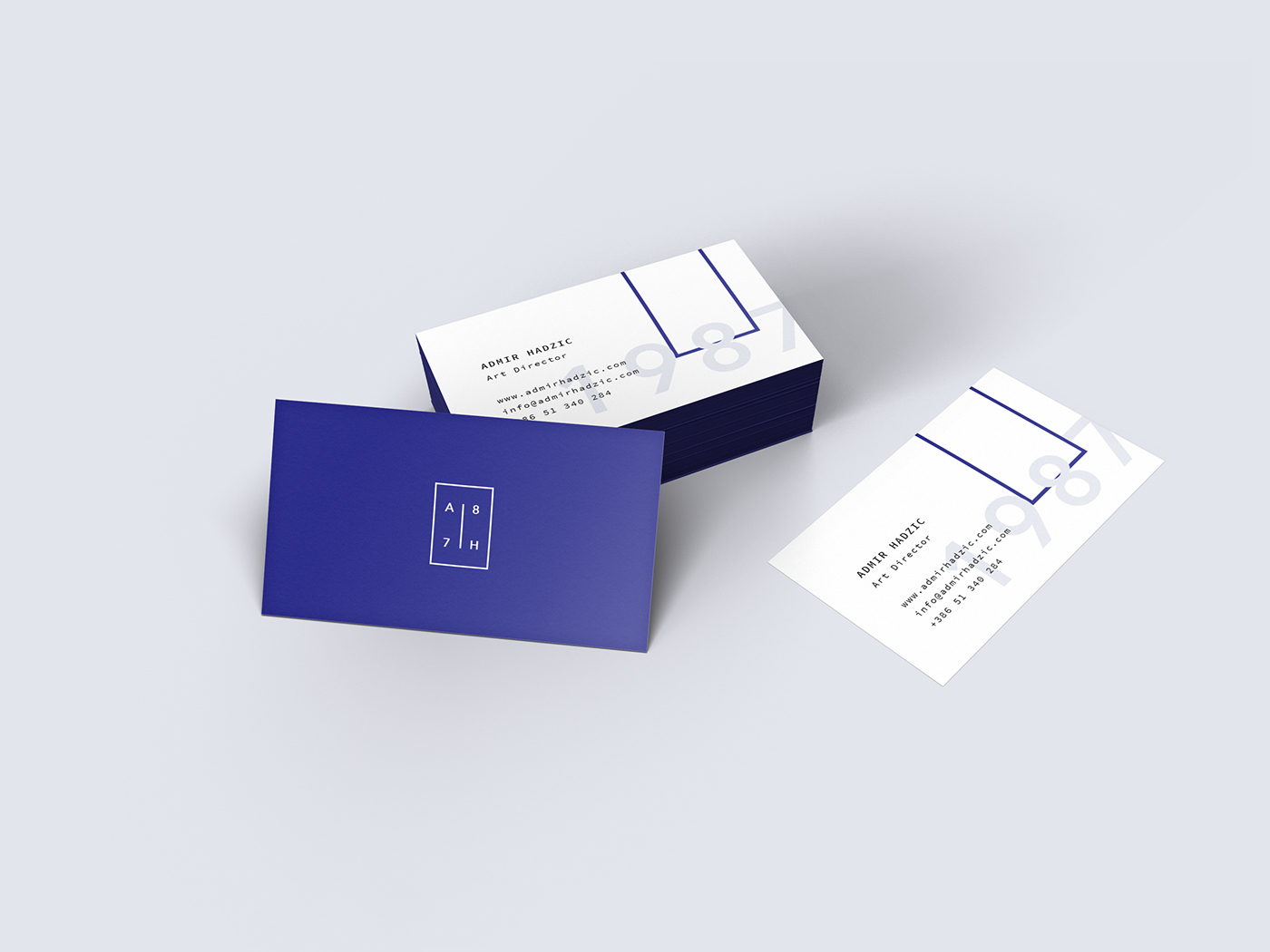
Logo
I was always fascinated by shapes, their meaning and artistry behind them. I tried to play around a bit by crafting some exploration, combining them with my name. The basic idea was that the shape (in my case a rectangle) represent and encloses me as a person. It defines and stretches the boundaries of space, where everything around it could be seen as small fragments of that object, that initially compose a complete and harmonic unite.
In short terms, the rectangle is me as a shell, and everything around it are the fragments that complete me as a person.
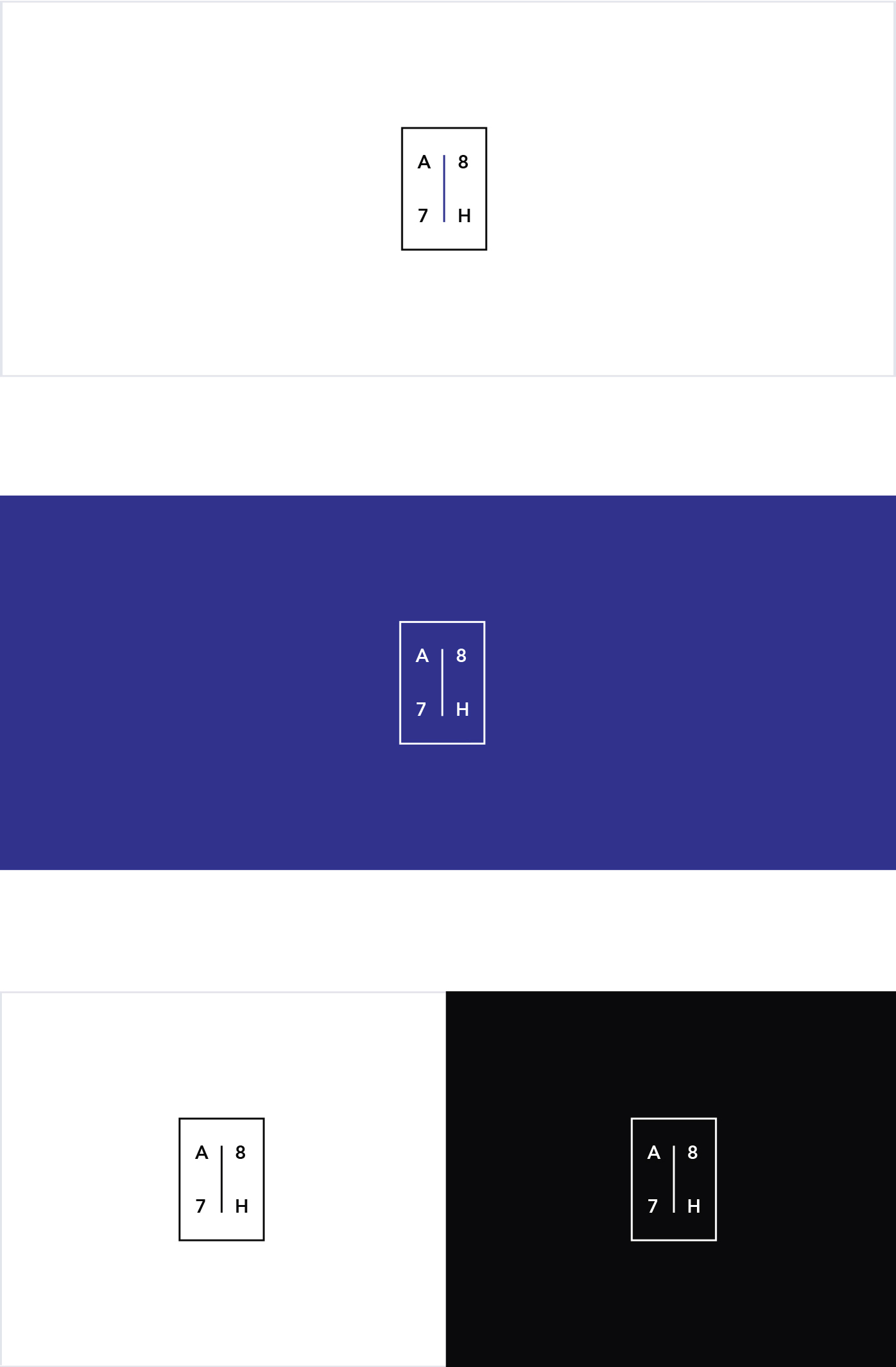
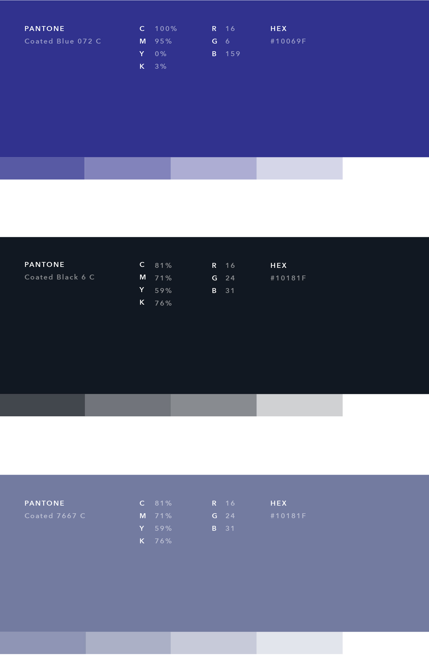
Colours
Black and white create the perfect balance and harmony to achieve simplicity. In order to break the monotony I decided to add different shades of indigo (which was always one of my favourites, even before it became overused and popular through Google Material Design *ouch).
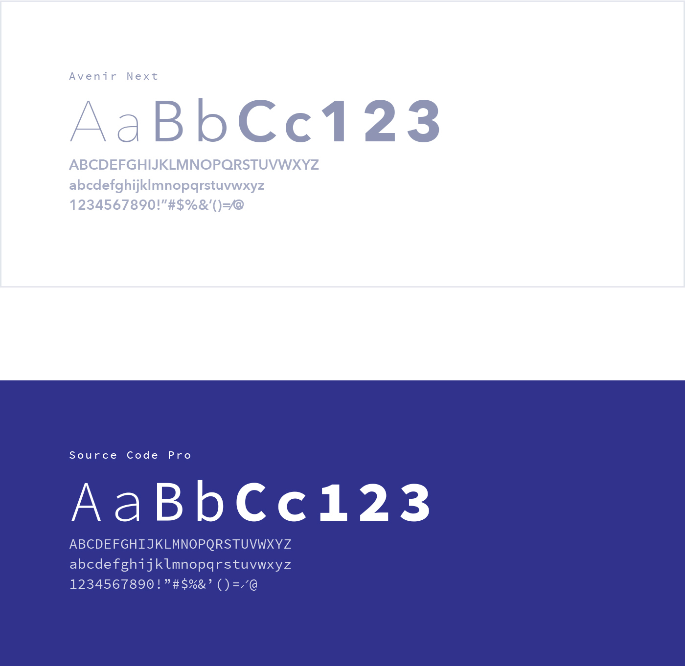
Typography
Avenir Next is a beautiful, modern and geometric Sans-Serif based font, that can perfectly deliver and express a bold statement. Source Code Pro delivers the classy counter-part, giving you that beautiful and readable Typewriter experience (personally I just love it).
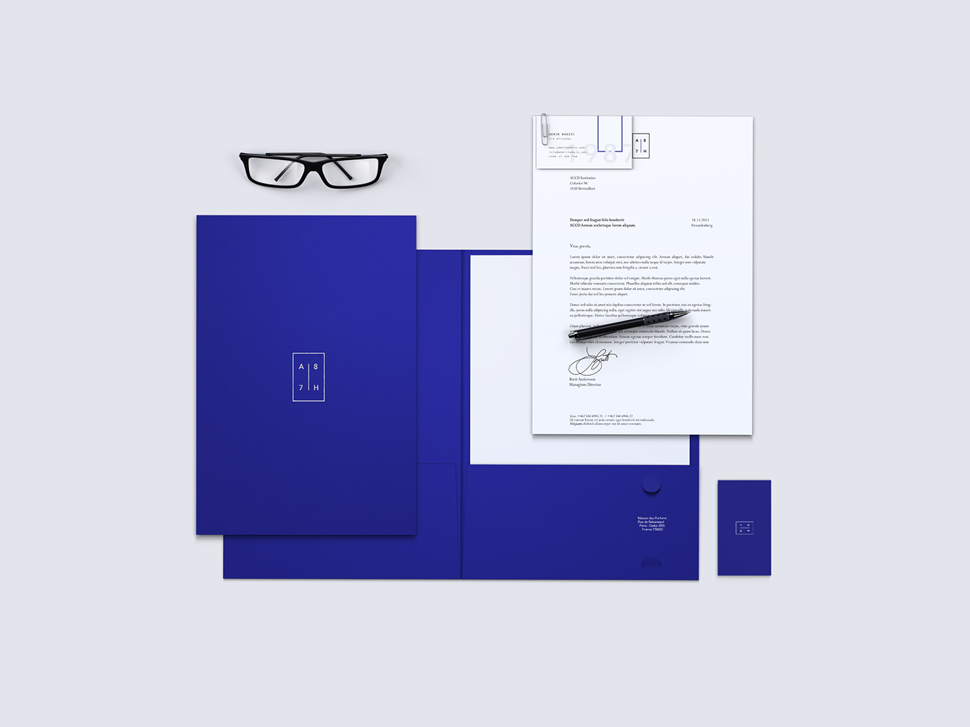
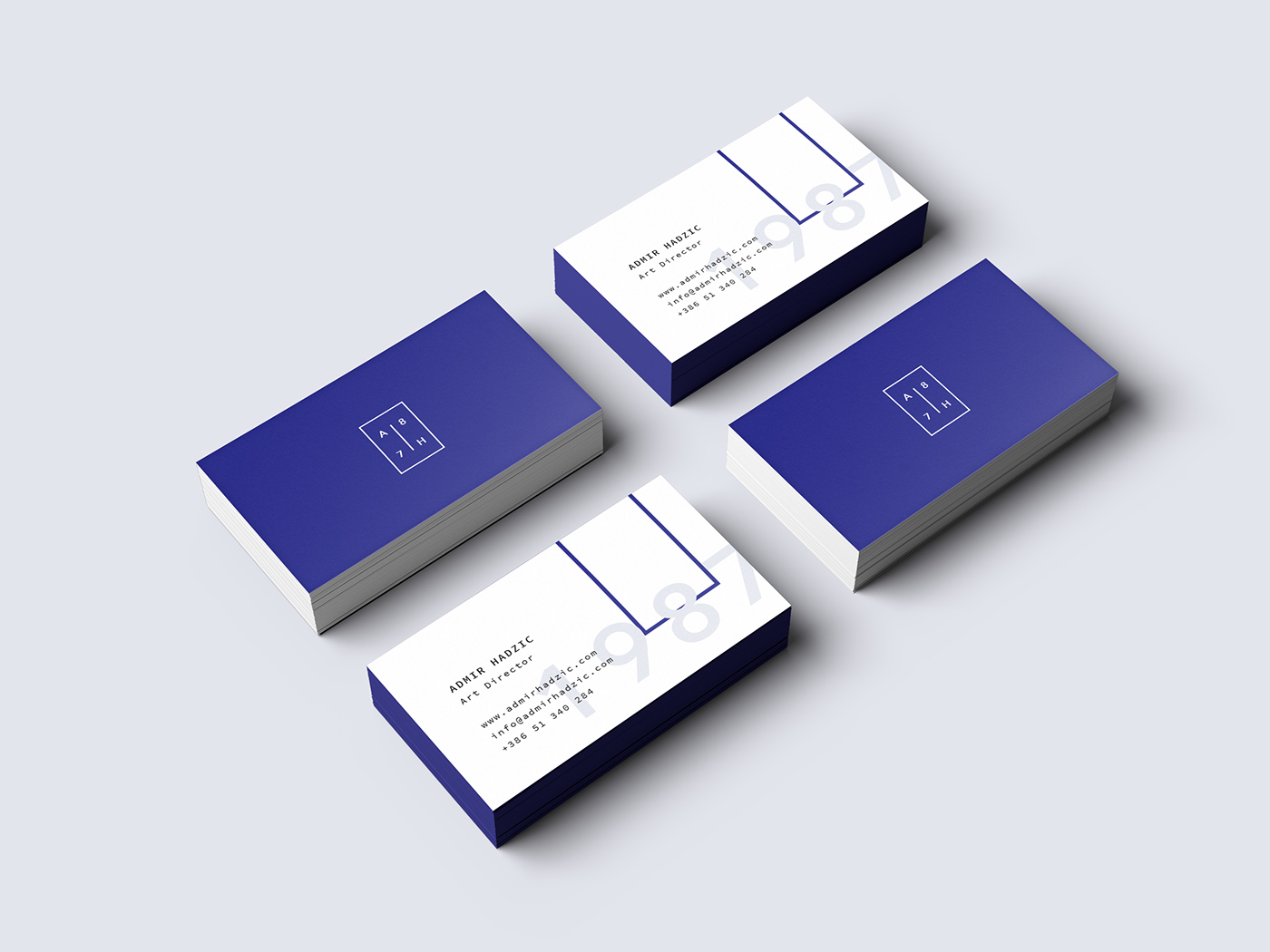
Brand Application
Some quick examples of the brand application across different elements.
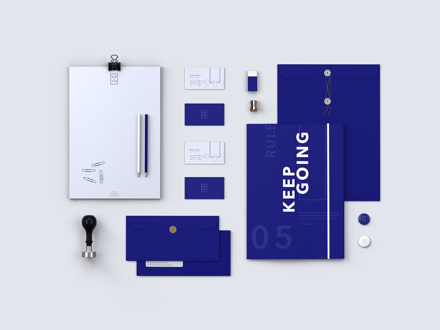
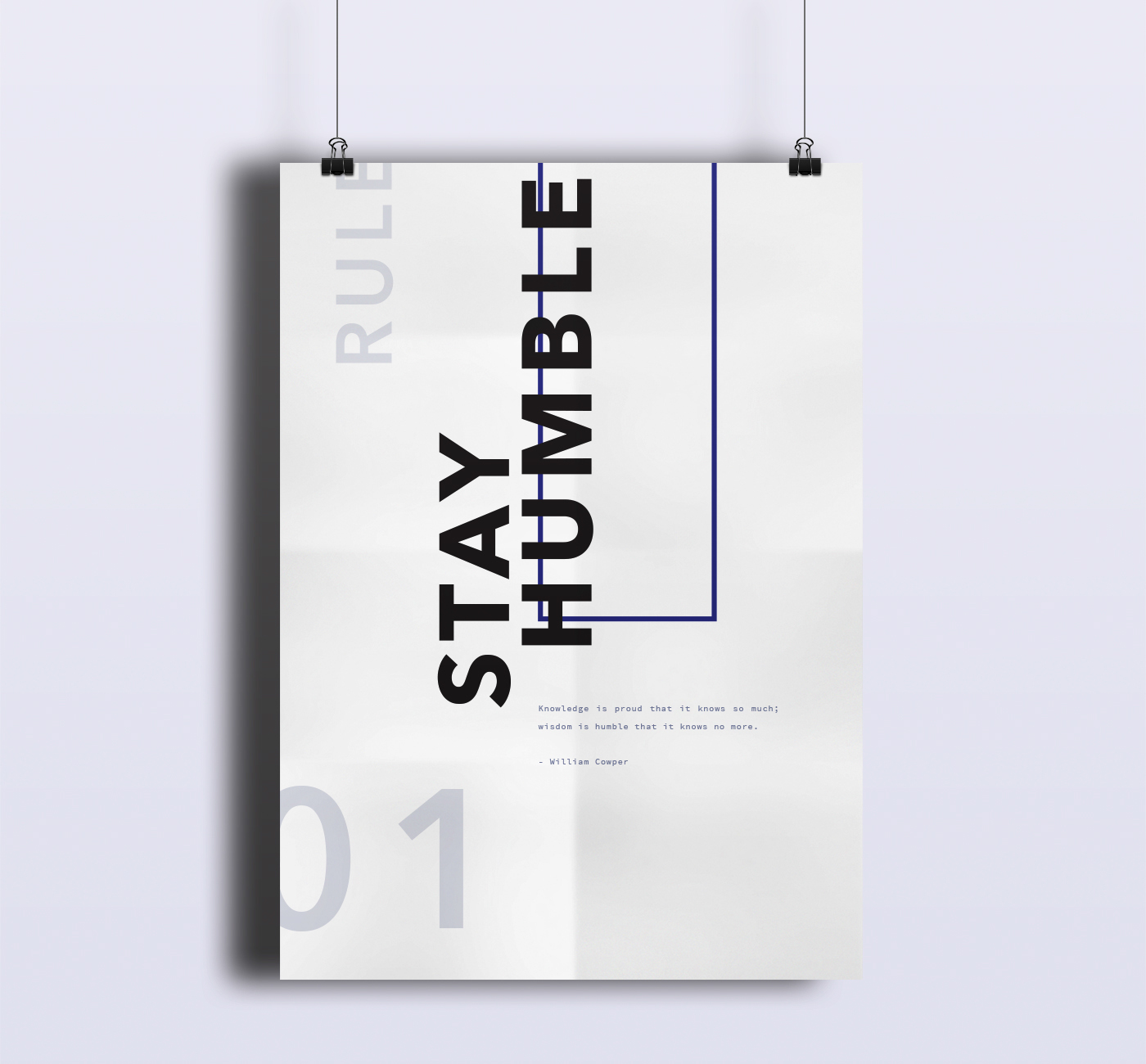
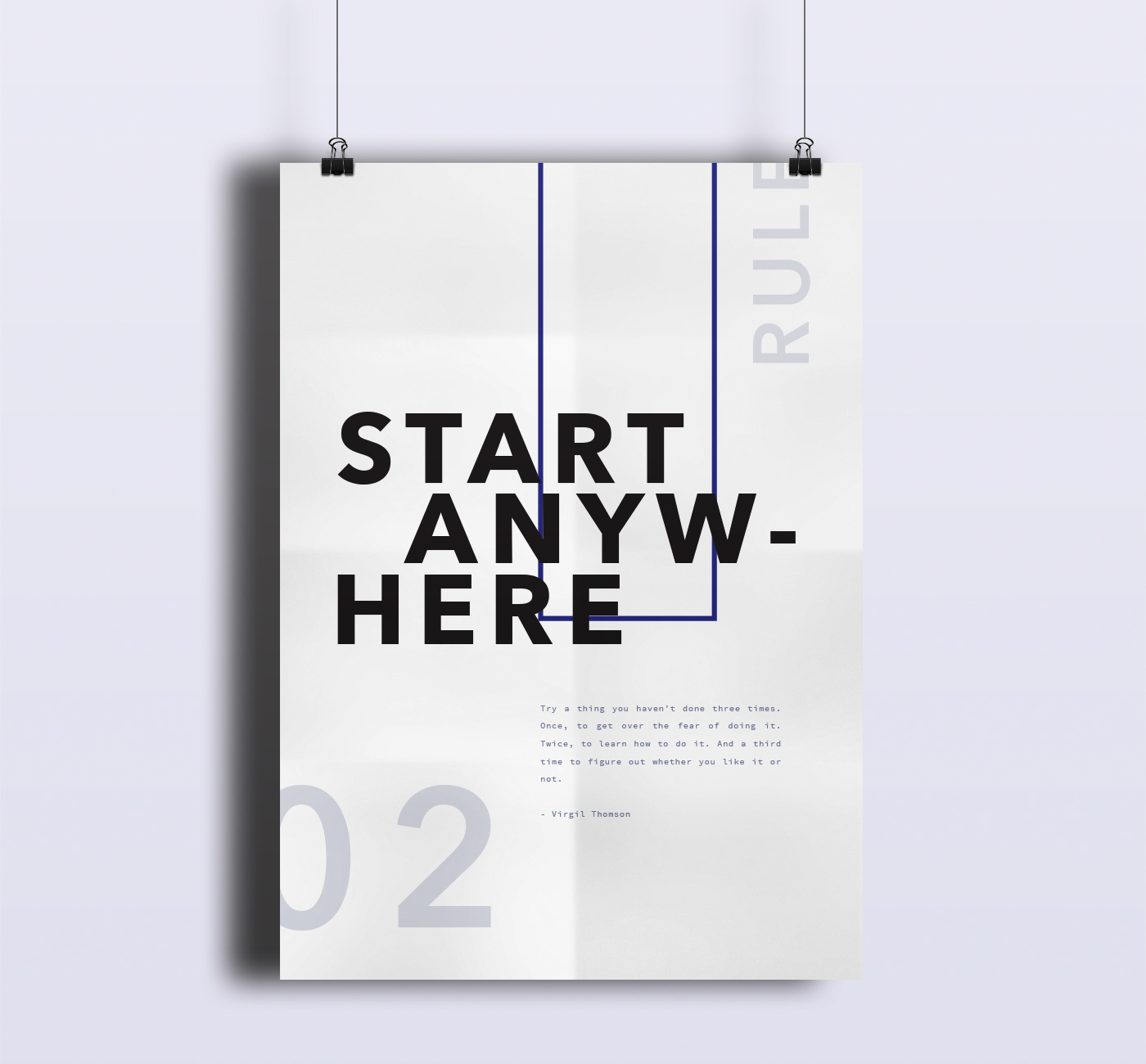
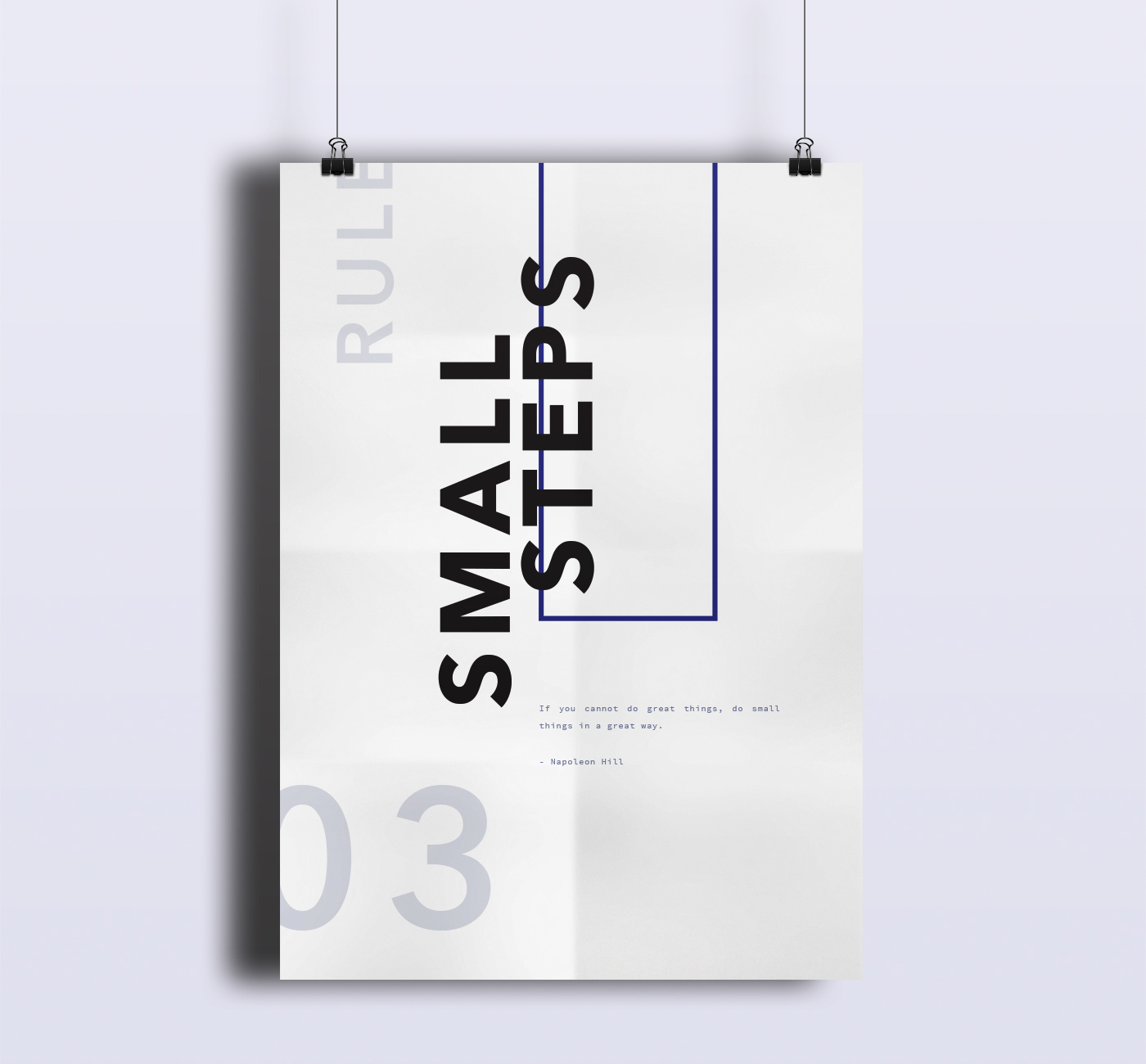
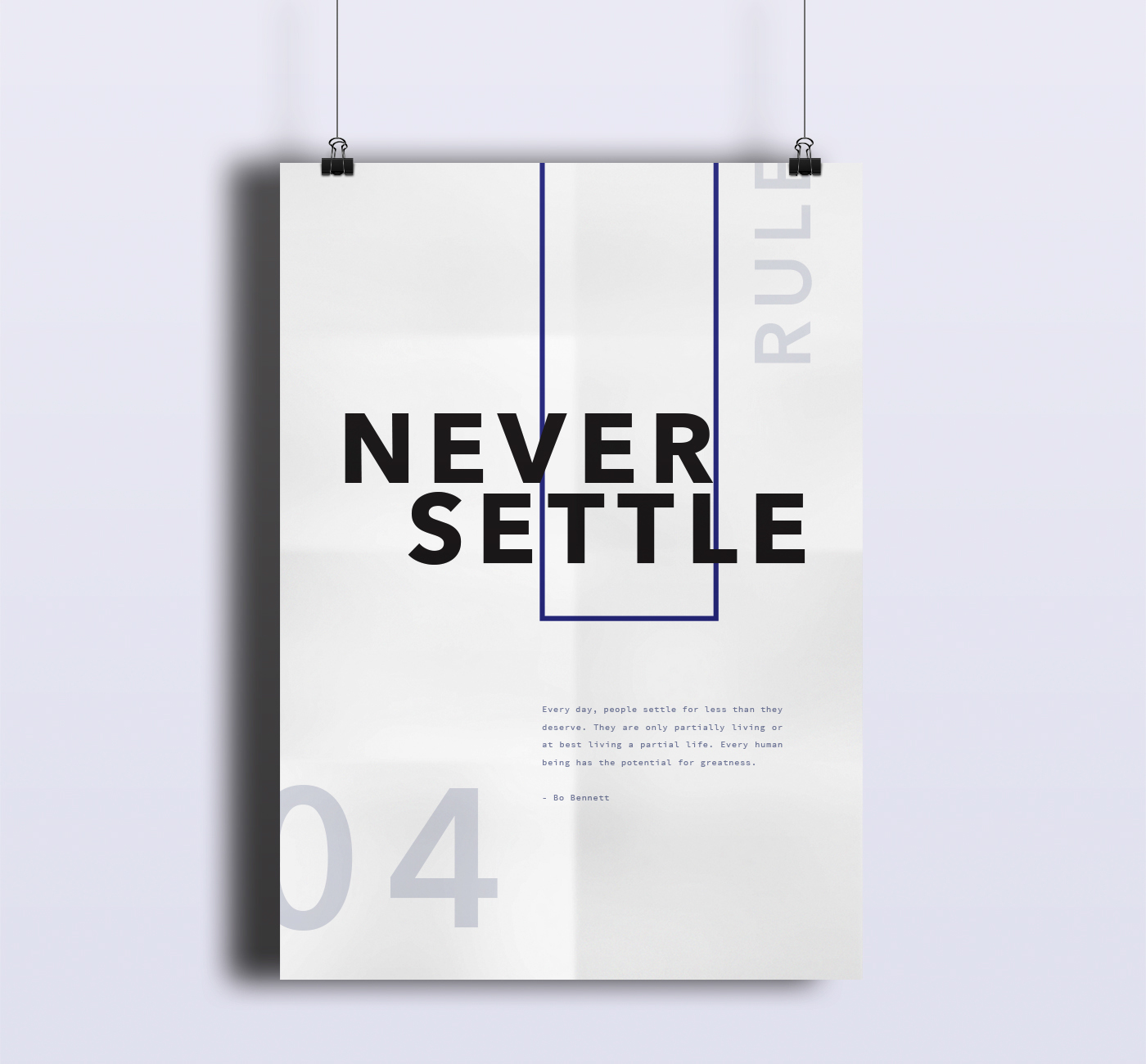
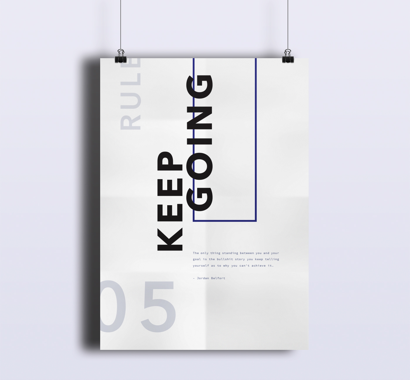
Rules
There are a couple of rules I stick to in life for motivation and guidance.
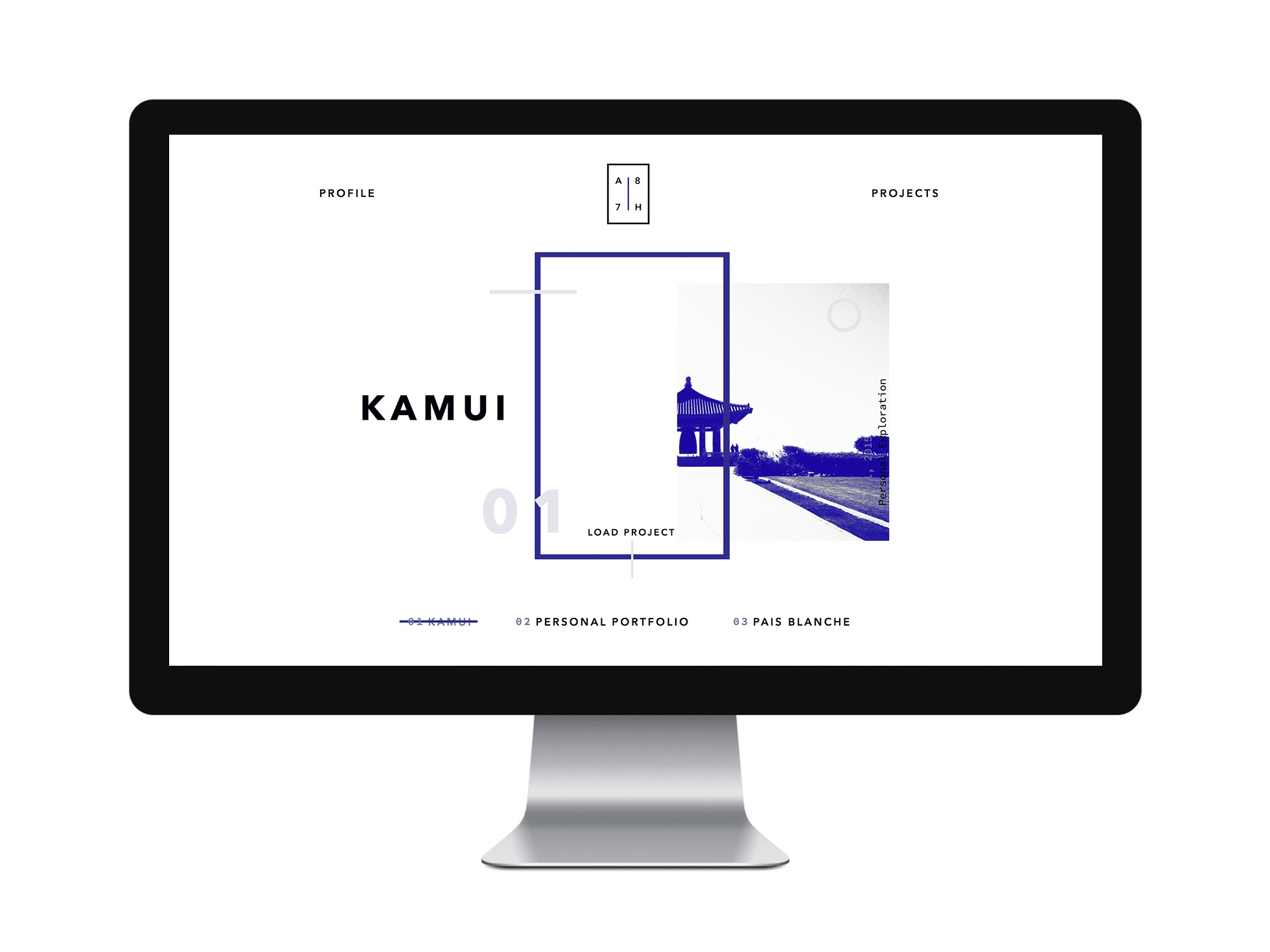
Digital
Stretching the project across the digital spectrum was probably the toughest job. In regards to my previous portfolio, I tried put more emphasis on the visuals, details and artistry of my work, rather than stressing the user with an overflow of animations and interactions.
Every single element is laid out pixel perfect. All the whitespace and balance between each section matches and follows the guidelines and patterns from the original design.
The project presentations come in natural, staying in tact and consistent with the design language of the portfolio.
The whole experience is accompanied by simple and beautiful page transitions, indicated by the floating SVG elements, followed by beautiful and expressional parallax movements and interactions.
Attention to detail
I have already burned up too much of all the readers time. Before I close the case, I just wanted to highlight out one amongst many small details that make a difference in your work.
For the project presentation I have used the very anticipated
<picture>
element, that lets you create a truly responsive image experience on the web. The difference to the well known
<img>
embed method for images, is that you can define multiple sources of images that are going to match the users screen and behaviour.
In short terms, instead of uploading a single huge image that is scaled across the device, you have multiple instances of the same image for different screen sizes. That heavily influences the experience on mobile devices that do not have high speed internet on disposal.
In my case for example, the project presentation page stretches up to 15-20 mockup images at once. Imagine each one of the mockups to be 2400px wide (to match retina screens) and about 1MB in file size. That means your browser is going to try and load a page of 20MB just in image assets (ouch).
Instead, I have 8 different instances of that image (4 * 1x + 4 * 2x instances) ranging from 200KB on the desktop version, to only as much as 8KB for the mobile version. That's a huge difference but all means you have to design and pixel perfectly align 20 * 8 mockup images for each presentation (I don't even want to get started on dealing with polyfills to make that cross browser friendly) -.-.
So even if the website looks quite simple and common, there are quite a few exceptional examples of how much attention to detail and work there is to make it smooth and beautiful as possible.
Comments 5

Great Tale Admir!!
Just finished reading it again. Fantastic work!