The Seminary website design. Part three

The design for The Seminary has been confirmed. I am starting to build the HTML/CSS site. I am sure, that there are going to be more surprises with the design!
Read about the design creation here:
Website design progress
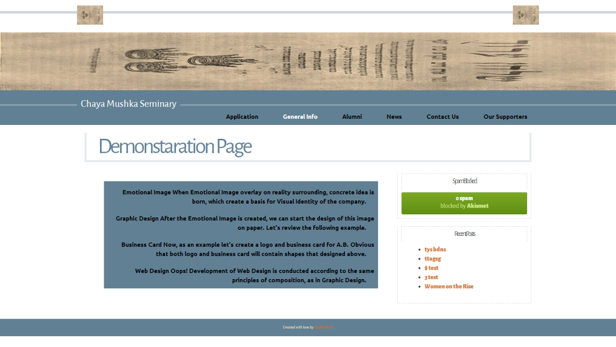
First layout test
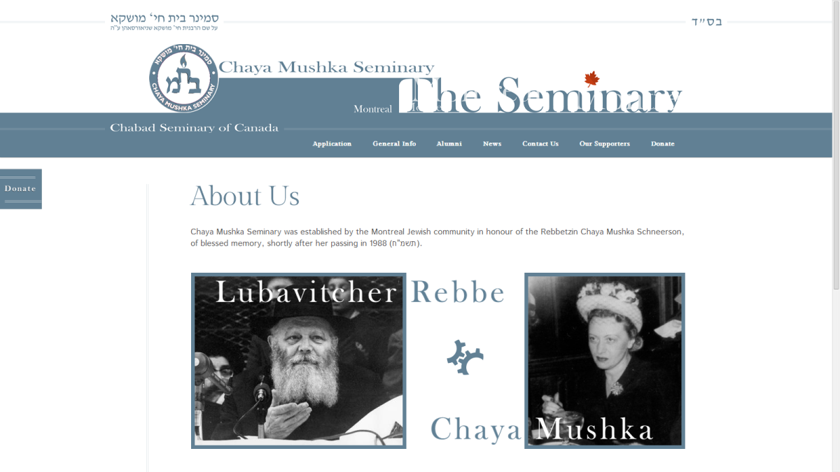
Using real images.
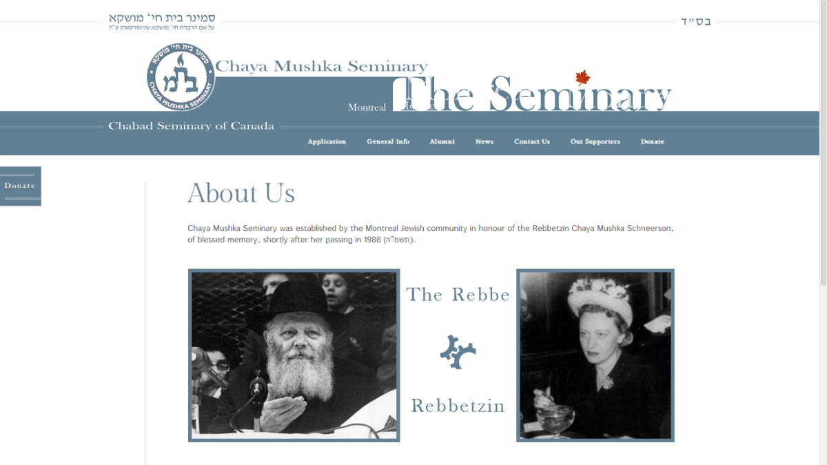
I improved the images quality.
Gold color for the navigation menu
Magic
Second usage of the graphic element.
The original design idea
But I like this better (I guess I will keep this one)
Test Header
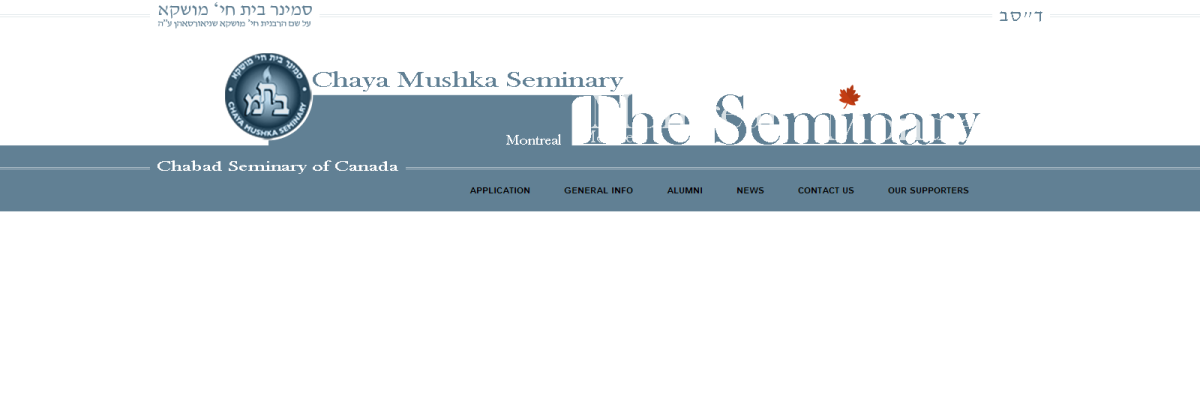
I still do not have a logo. Header test – solid circle instead the logo.
Fake logo. Test
Dabbled line on the left side

Watch the details
How interesting! One small detail (two red lines on the left side of the content area) – can change the balance (not sure if I will keep it, but this is amazing).
Footer design
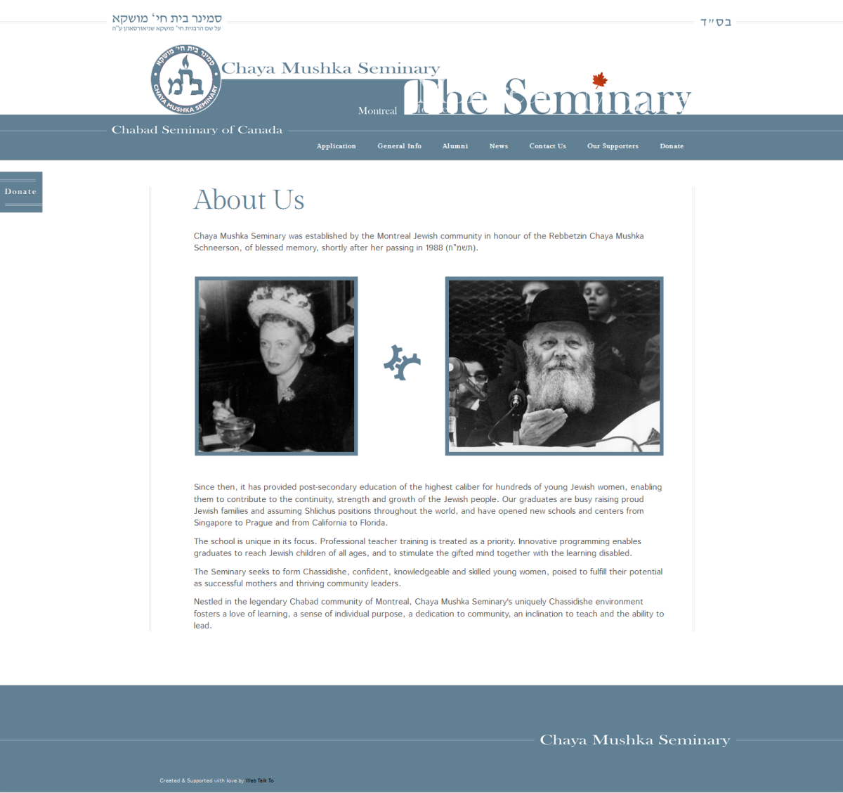
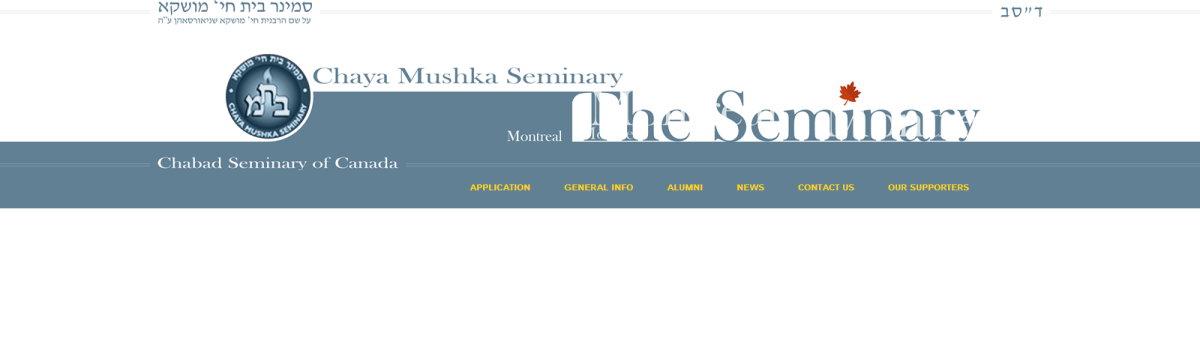
First overall image
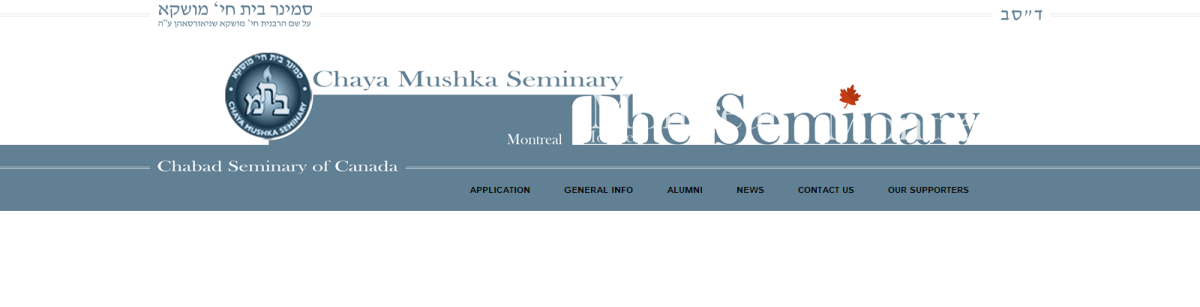
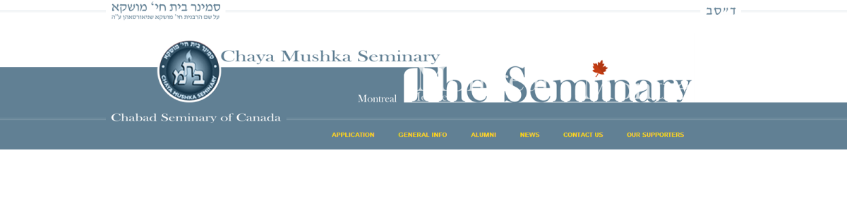
Navigation color test
Navigation panel
Overall image
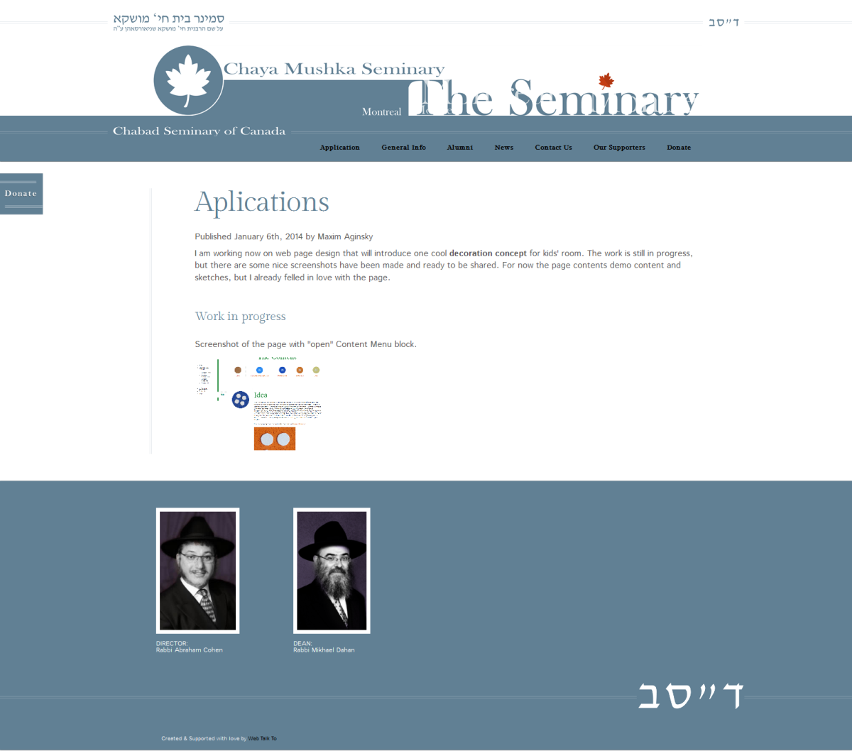
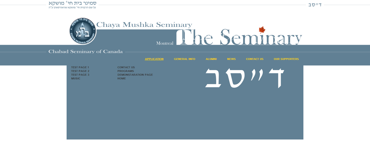
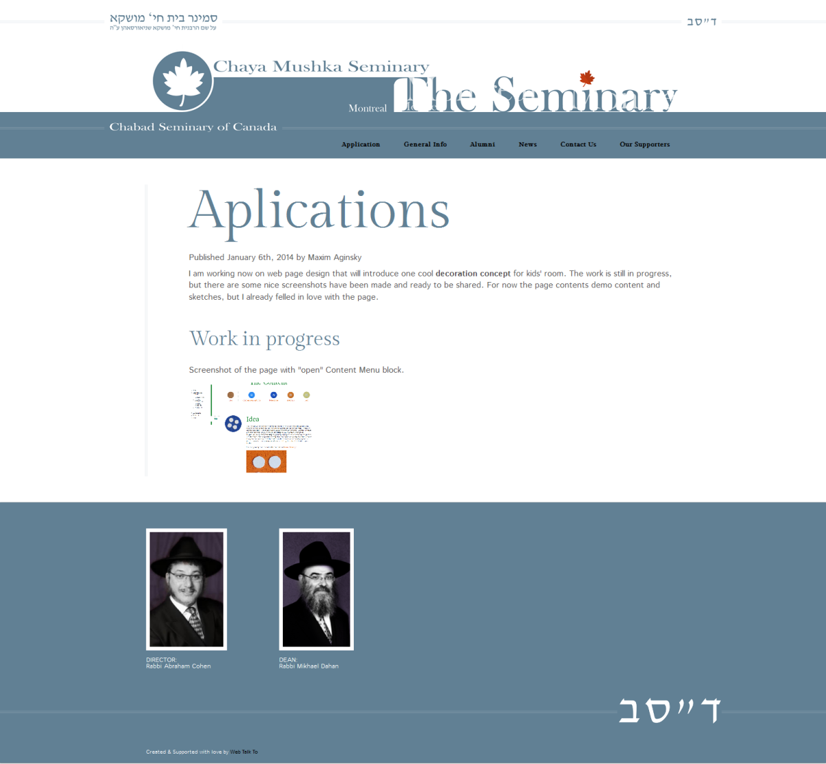
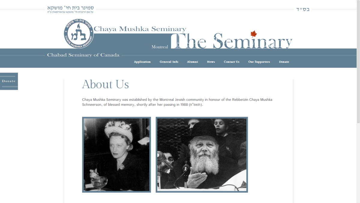
The Content
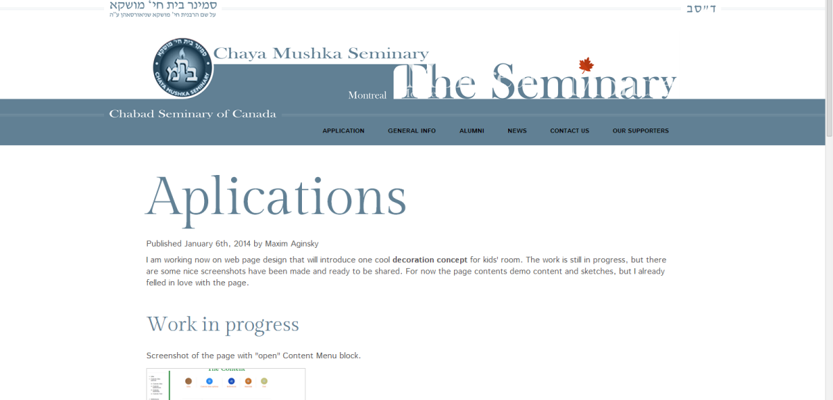
Styling the content for the front page.
I decide to use lines on both – left and right side.
Final
27 February 2014
Still missing the site logo.