The Seminary website design. Part one


Maxim Aginsky
accidental ꩜ initiates ꩜ serendipitous
Maxim Aginsky
I am starting to work on the design for Chaya Mushka Seminary website. So let’s create a story!
I would like to mention that they’re going to be at least two (maybe more) articles related to this project. To read the next one please check link at the end of the article or click here.
On December 31st 2013 I had a meeting with Rabbi Abraham Cohen and Rabbi Michael Dahan – director and dean of the Chaya Mushka Seminary.
We talked about the goal of the project and also what and how should be displayed for the public. Remember, we are talking about site design for religious organization - Chassidic seminary for girls.
Chaya Mushka Seminary aspires to foster a Chassidic environment conducive to academic growth and character development for students of Montreal and abroad.
Chaya Mushka Seminary provides affordable, quality, College level and Jewish education.
Intro
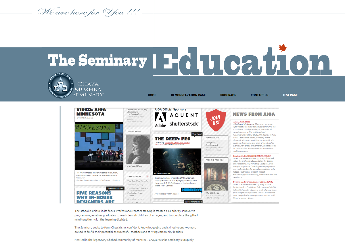
This is a screenshot of the current site design. This one was created six years ago.
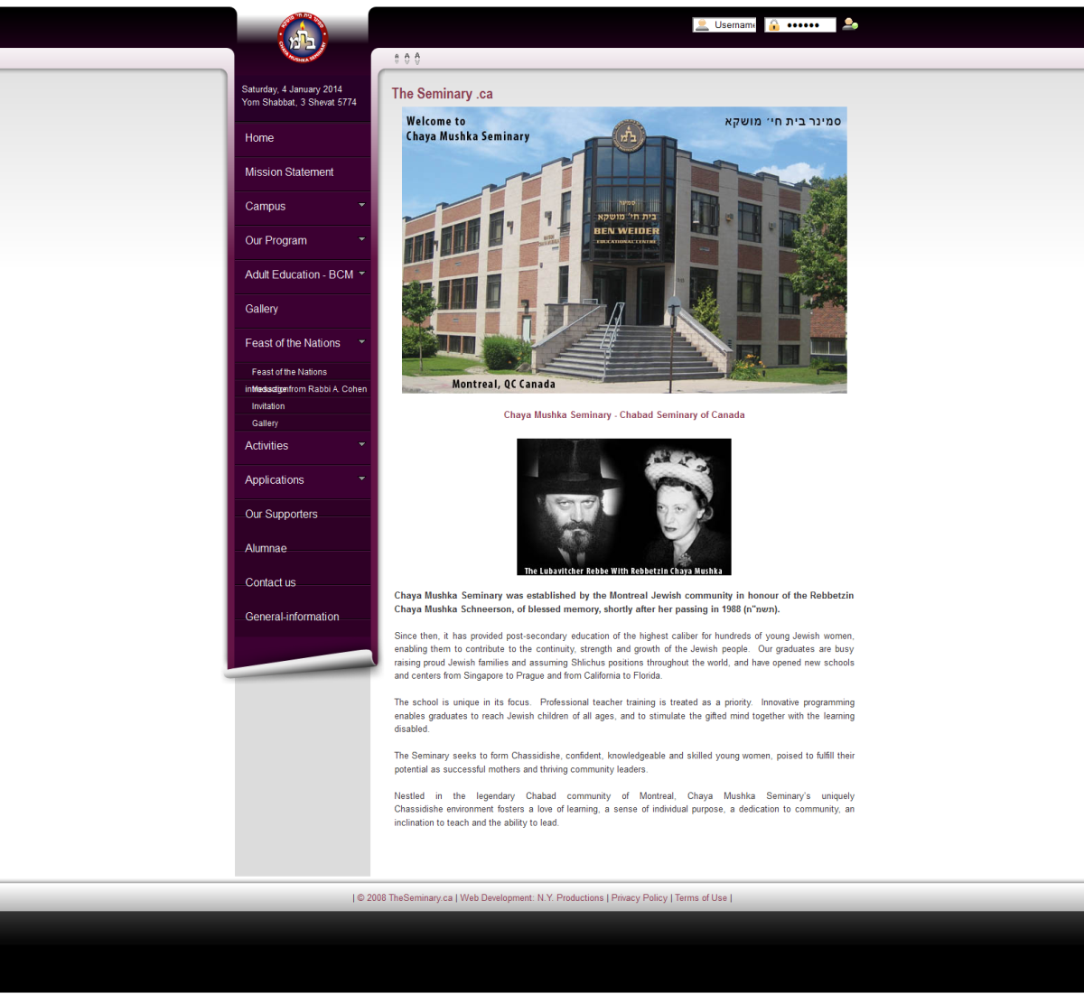
Do I like it!? – Yes! The idea for navigation menu – scroll – is great, love it! The colors choice is good too - modest. The Header that converts to the menu scroll is done perfectly. So, what is wrong with the current site design – you will ask. Well… I would say almost nothing, if not mentioning that there is always possibility for improvement. There is just about a time to create something different, that – hopefully – would better match the existence of The Seminary and will look more attractive for the potential 2014 - 2016 clients.
Speaking technically the current design has couple problems, for example when you click parent tab the sub tabs covering each other. The site also has features that useless for the school, such as – Flash gallery and missing features that is important, such as – application forms and ability to manage content. But what is more important is that the current site is not User friendly.
Uff… Ok. I guess that last sentence should go on top of others. Finally I found a good reason and we can stop talking about current site design. Great!!!
Sofi just said that she prefer this (current) site design vice my version (I just showed her the final design version, not final - final, but final) – because it is more colorful – she said. – Well!
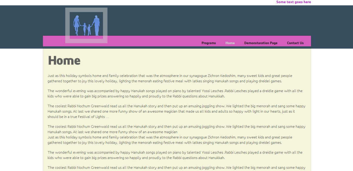
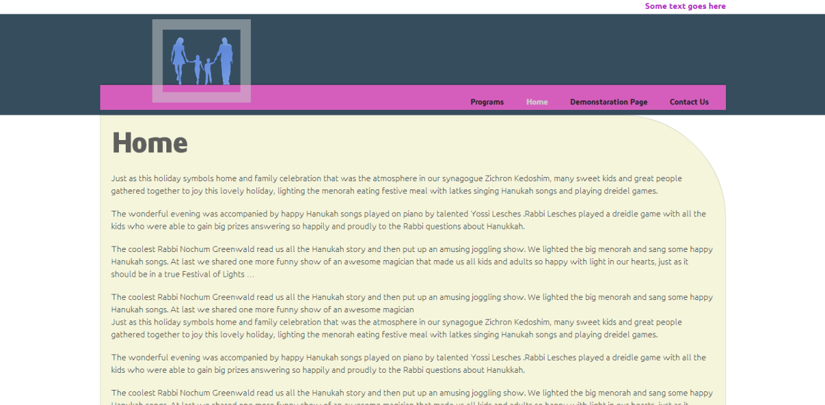
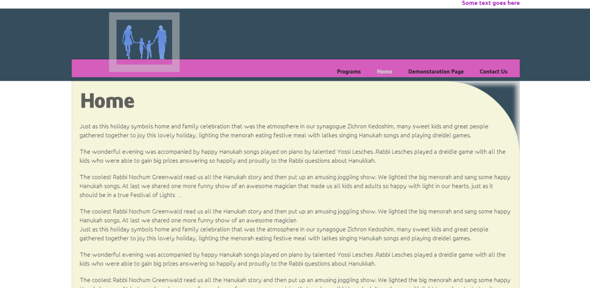
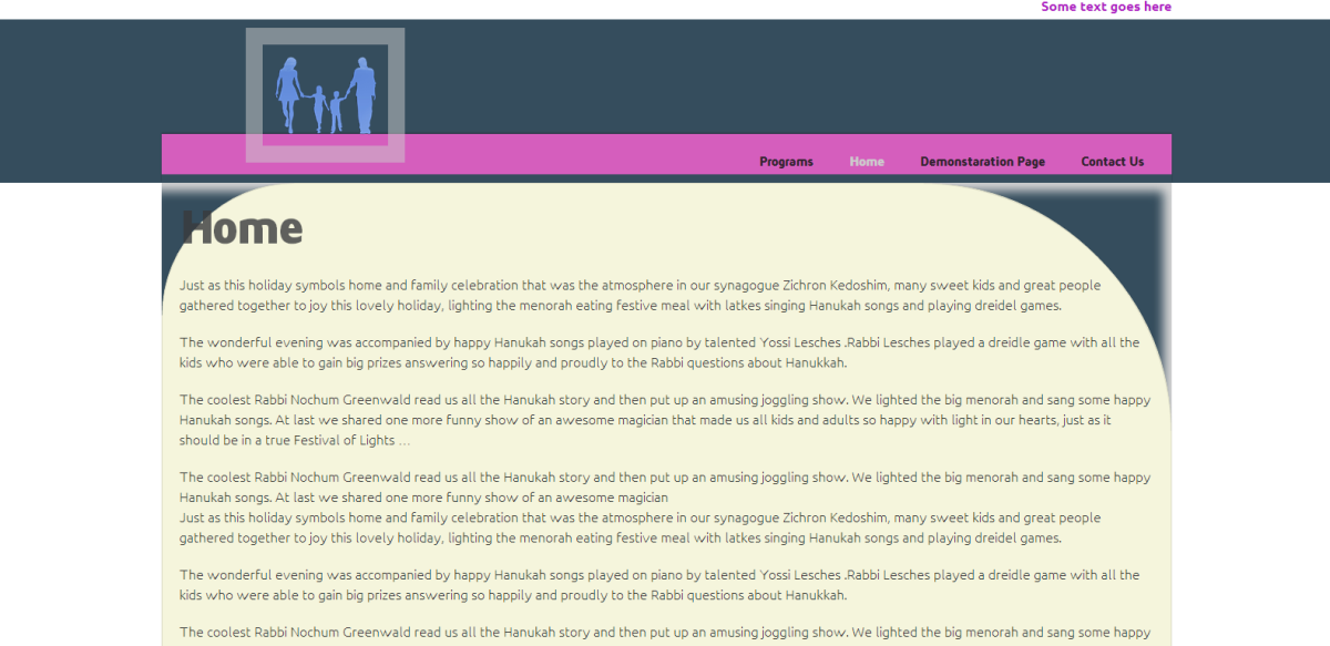
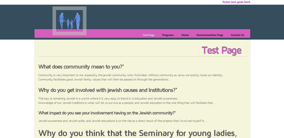
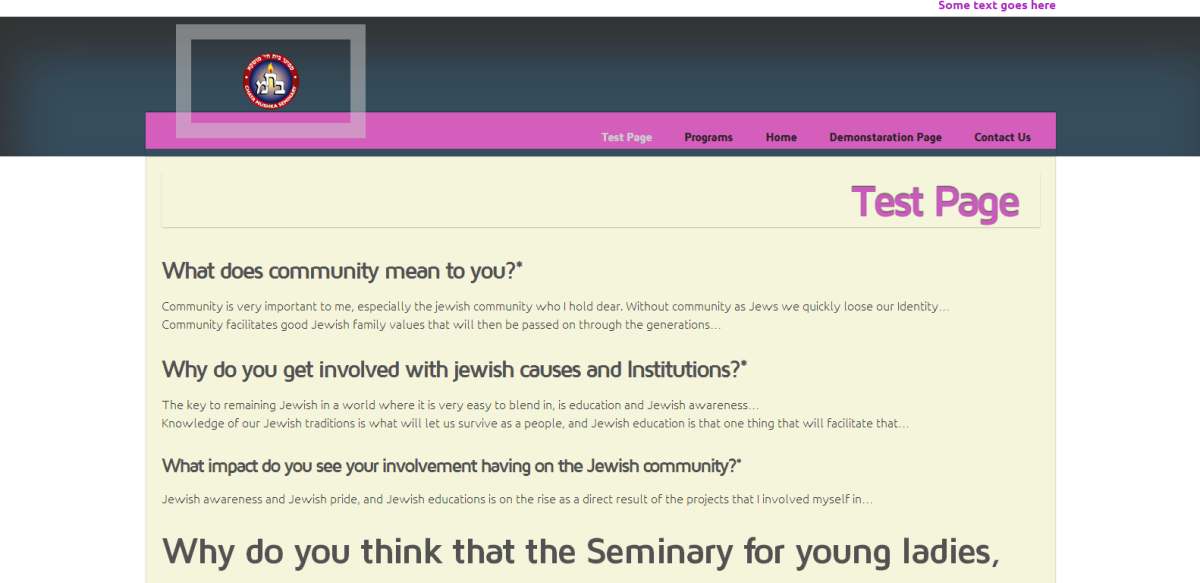
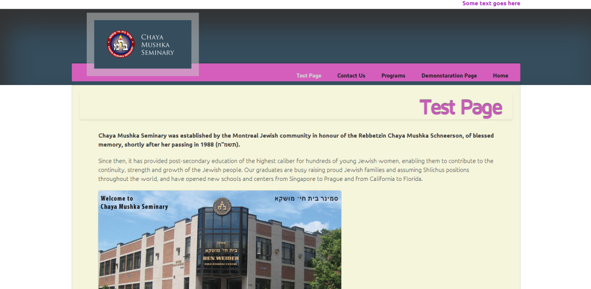
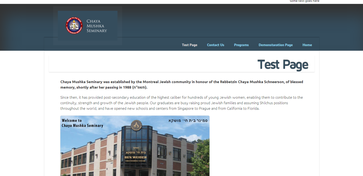
Site design. Working progress
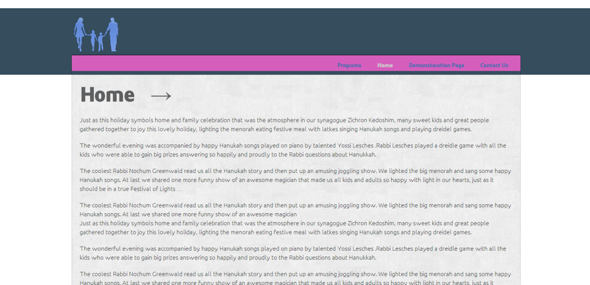
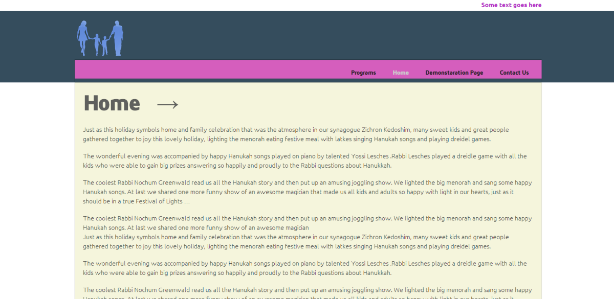
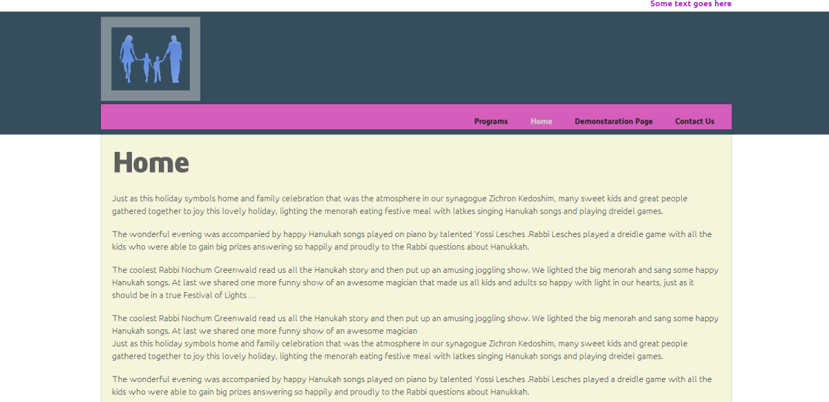
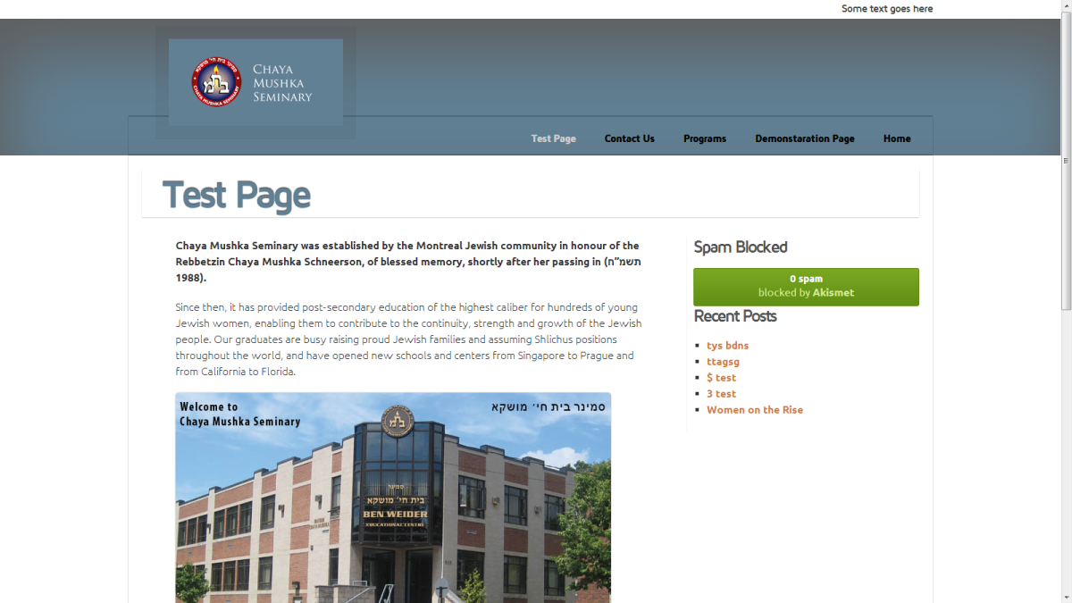
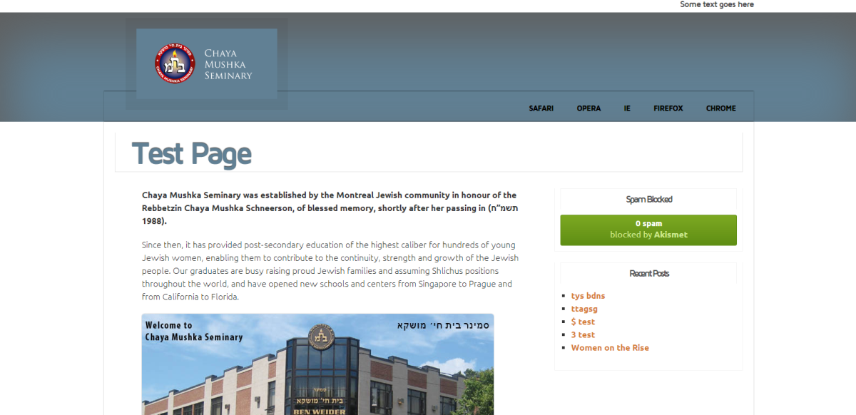
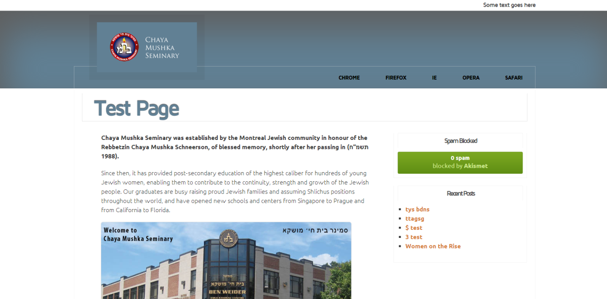

Fresh idea. Ladder
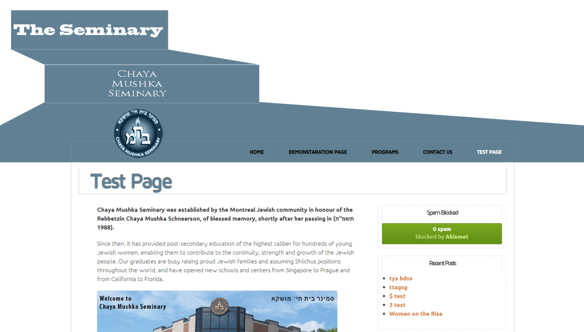
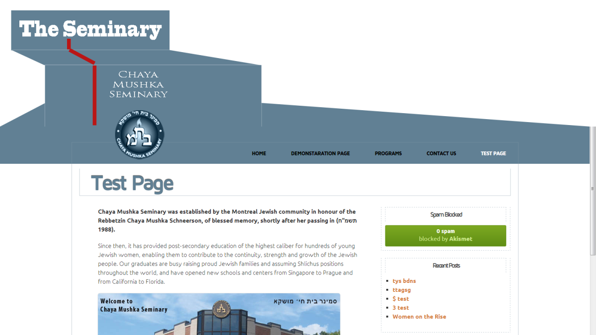
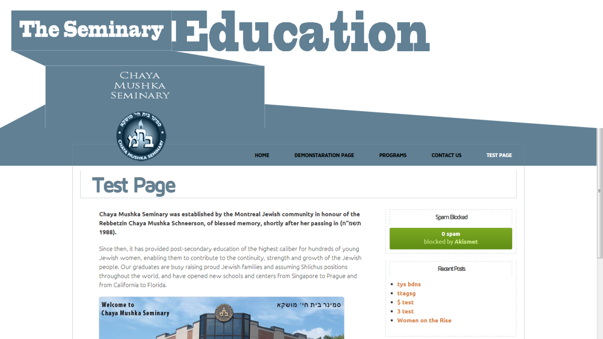
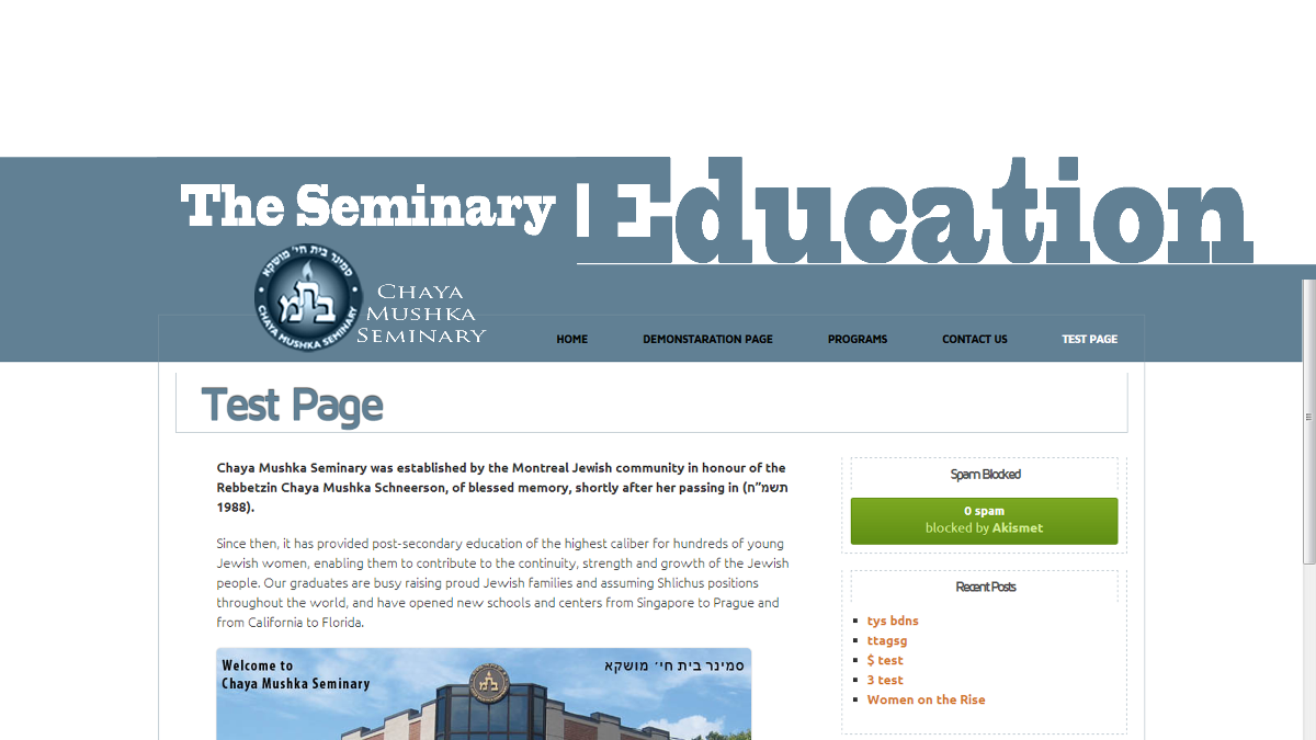
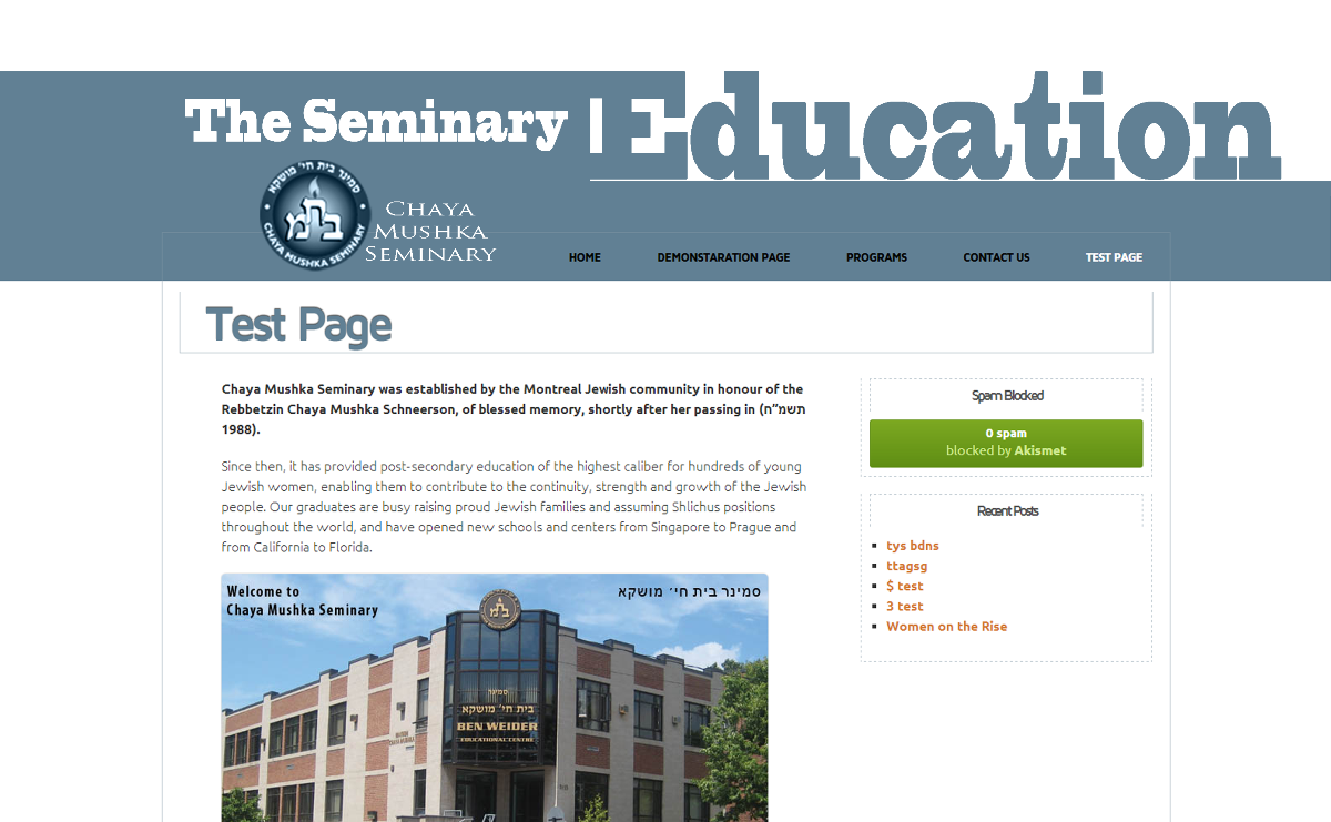
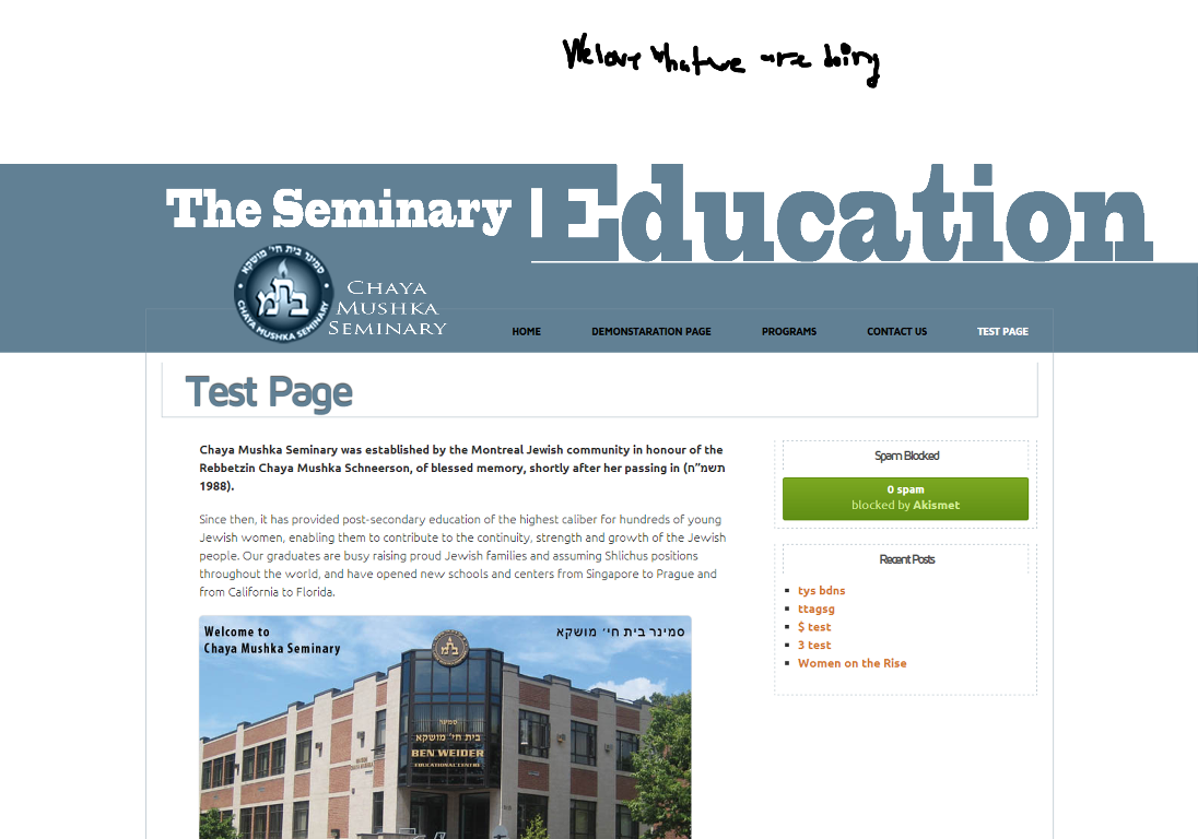
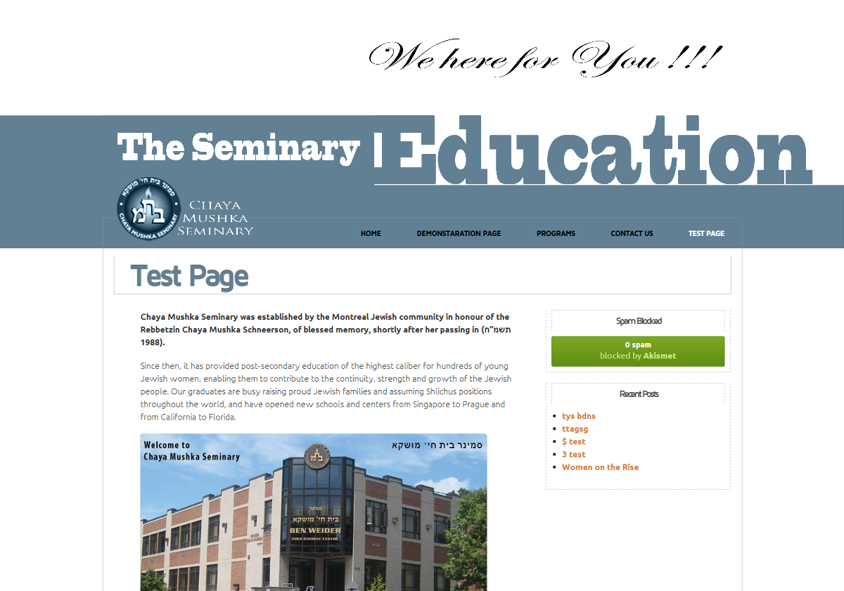
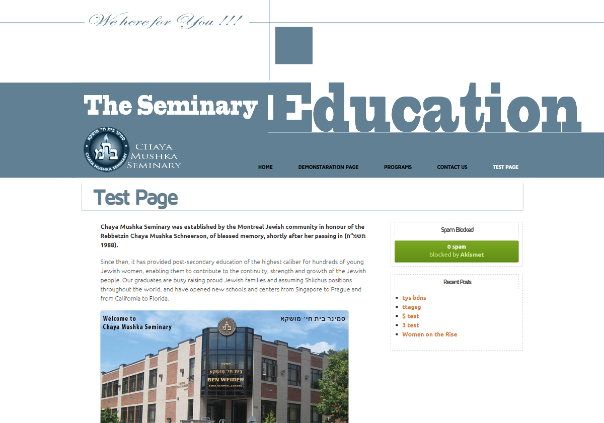
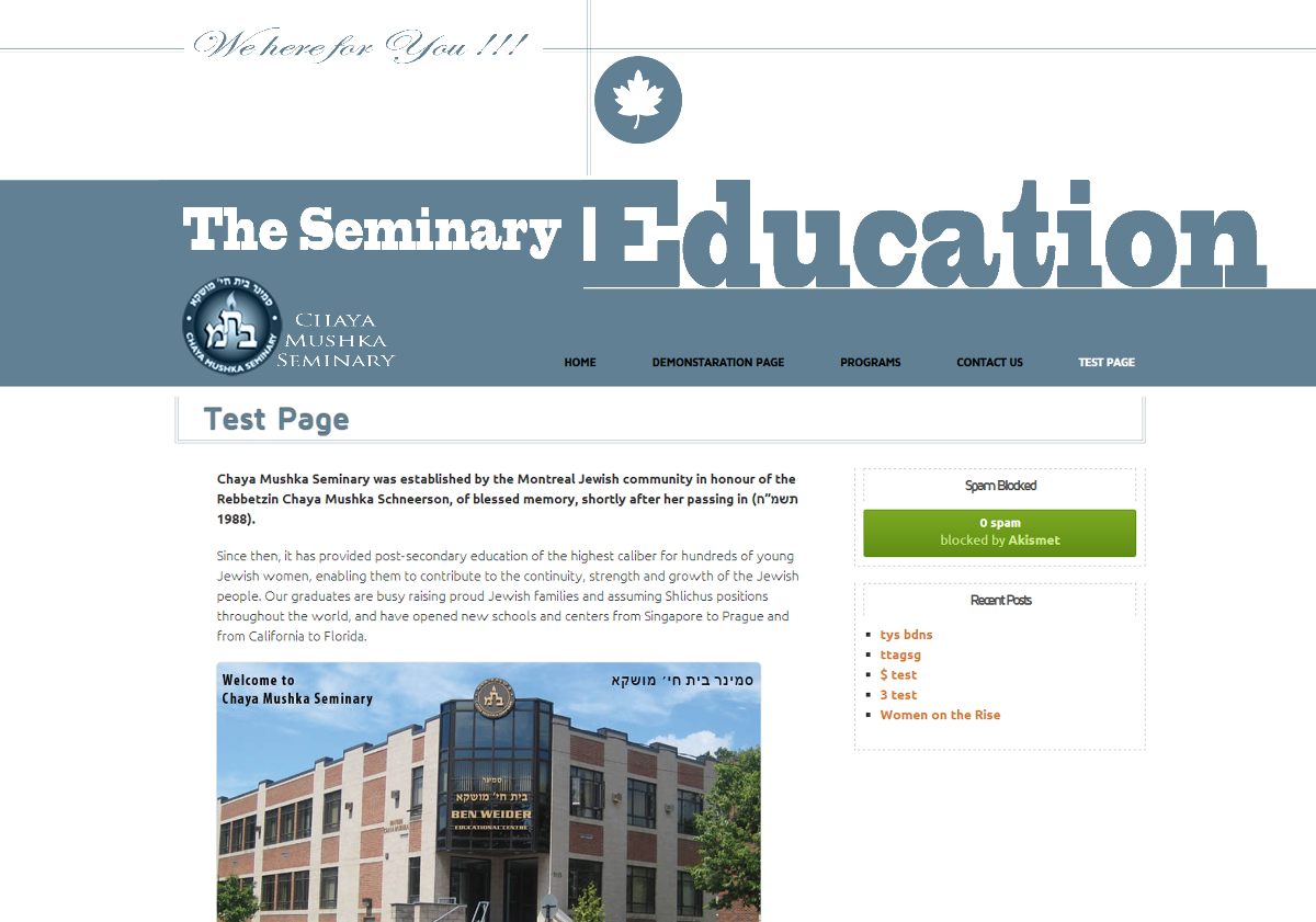
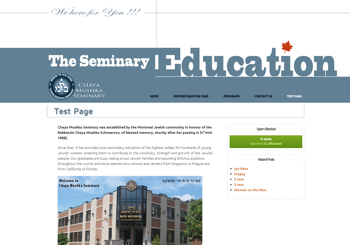
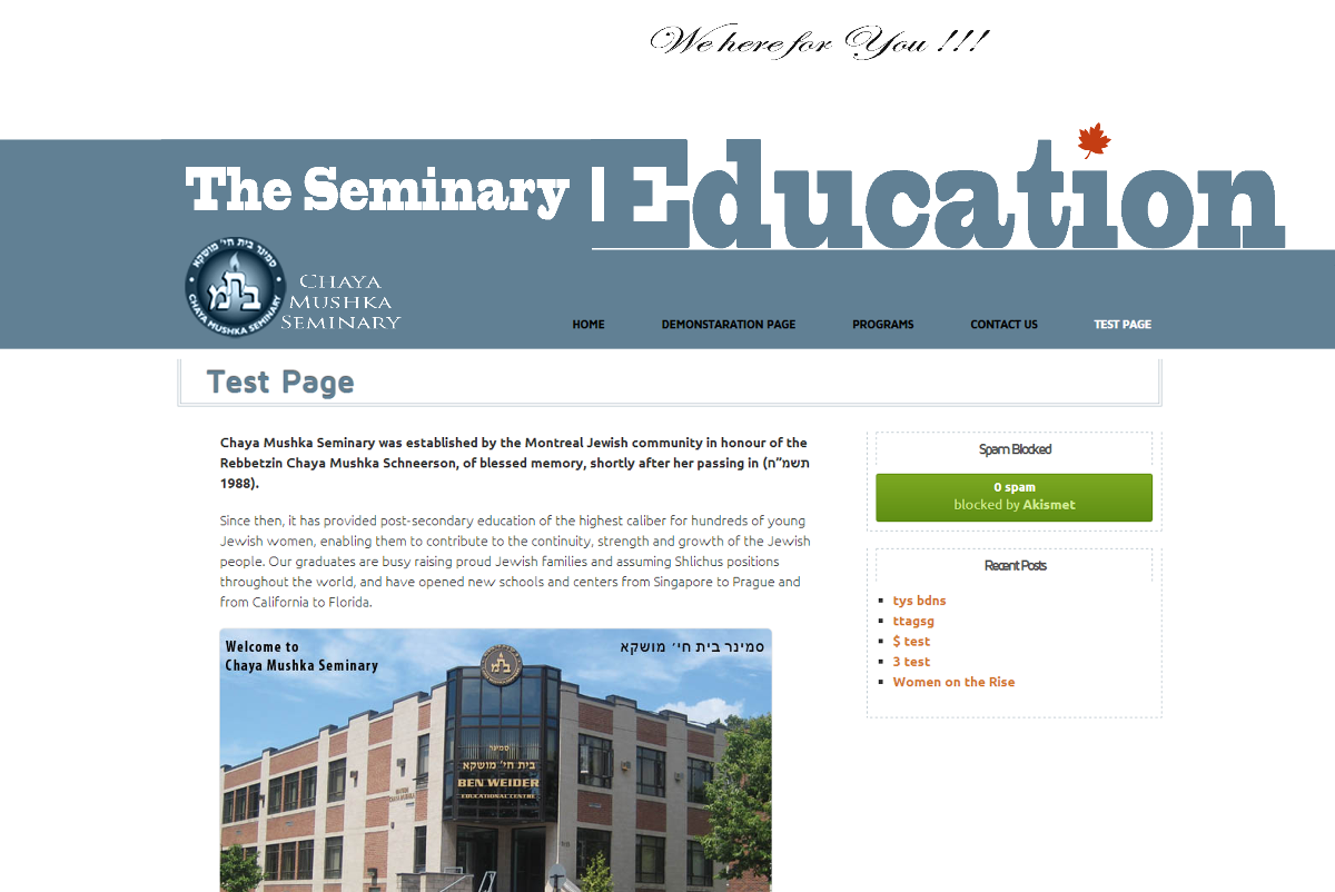
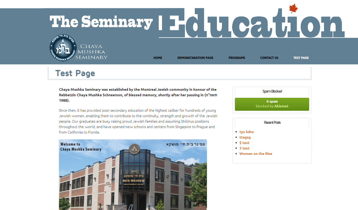
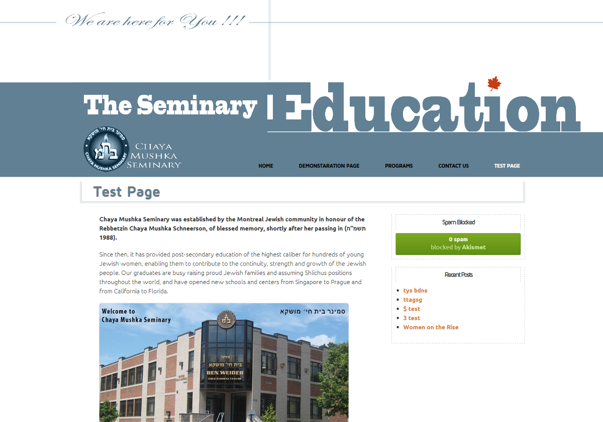
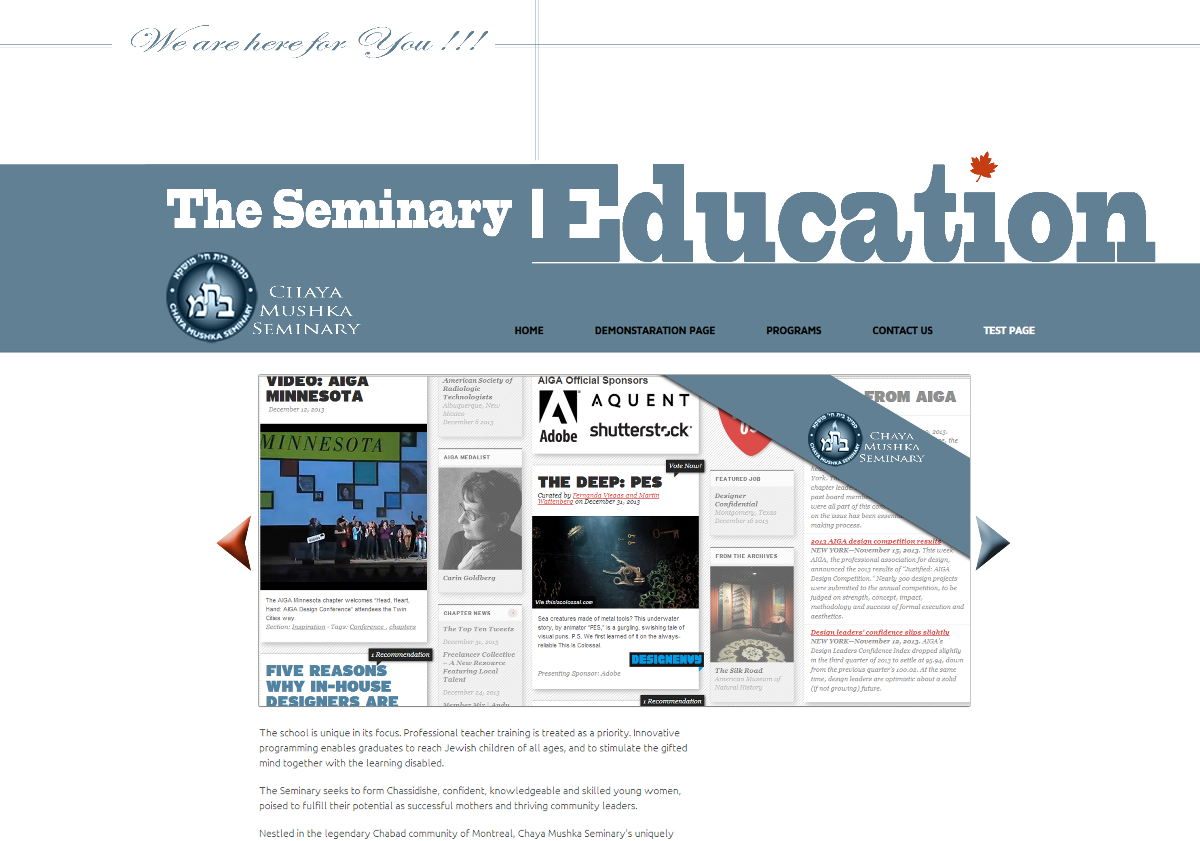
Slideshow
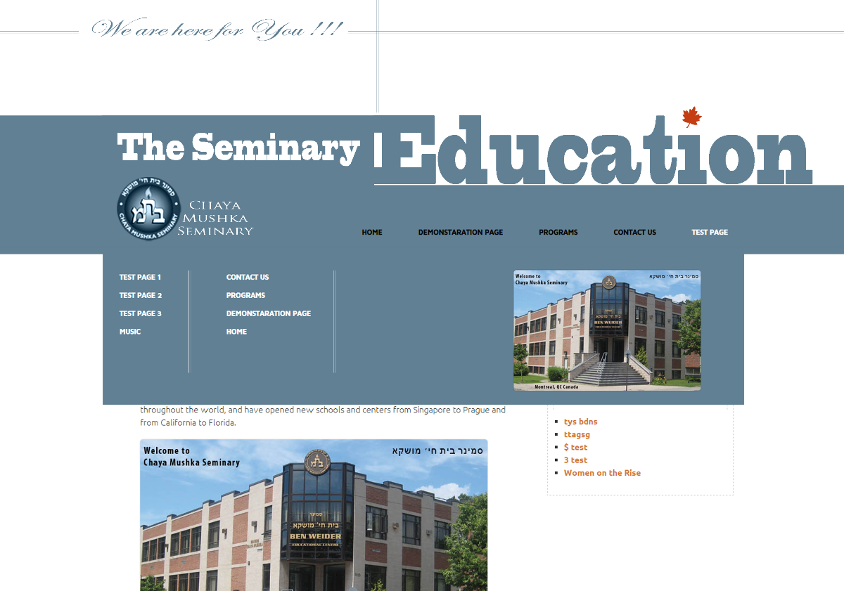
Navigation menu
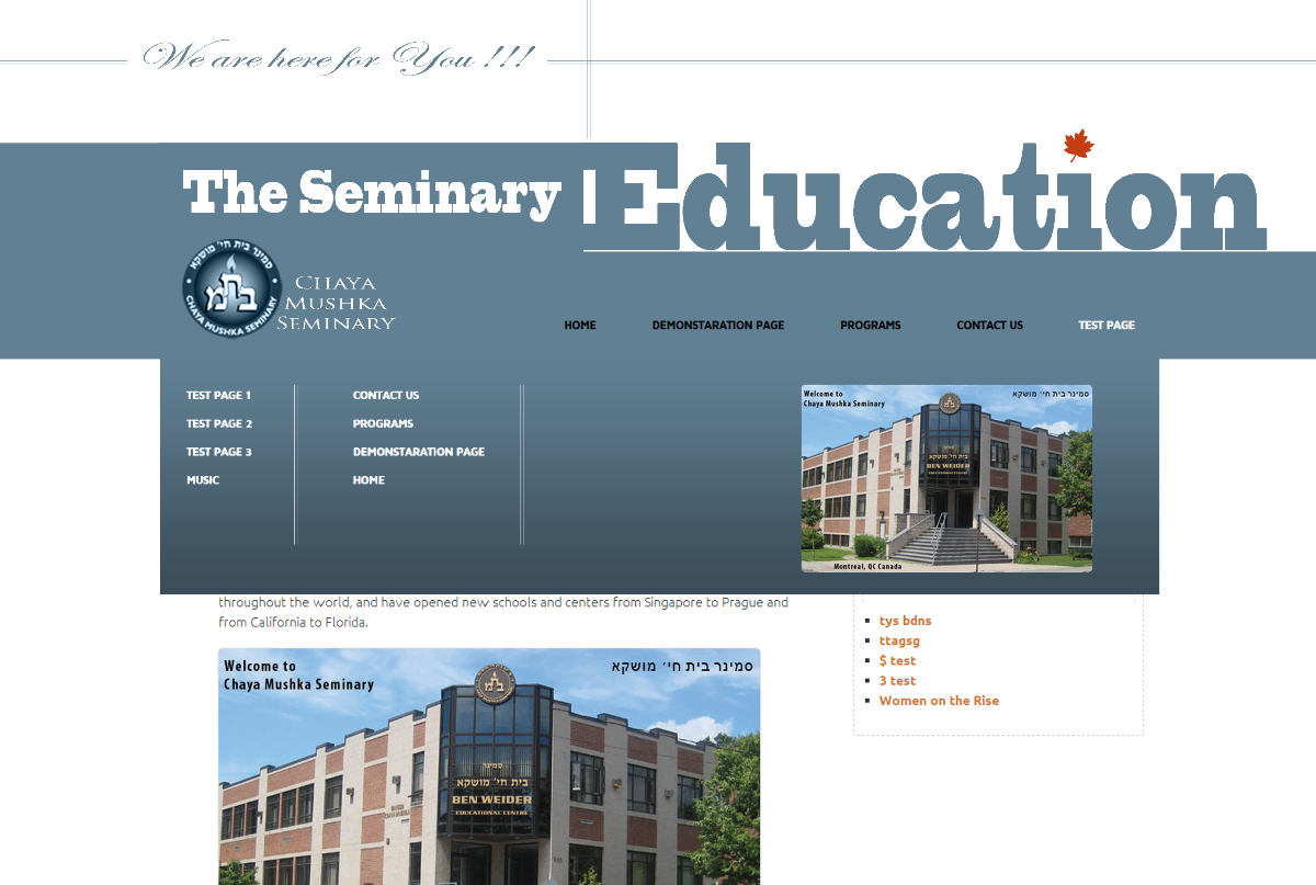
In this point I feel like showing the result to the customer. I am very excited – I love the design.
To be continued: The Seminary website design. Part Two