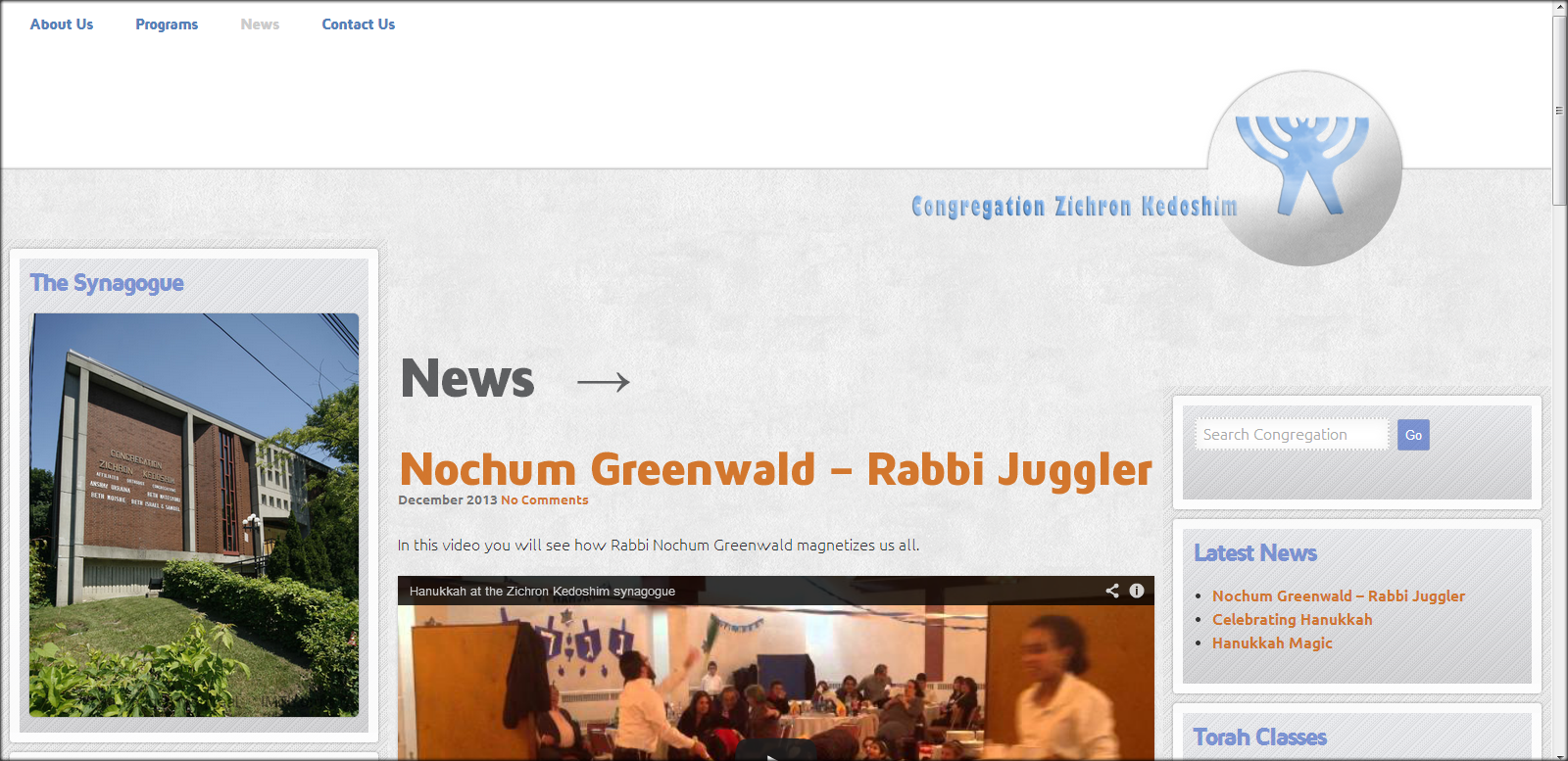
Site redesign for Zichron Kedoshim

Final design screenshot
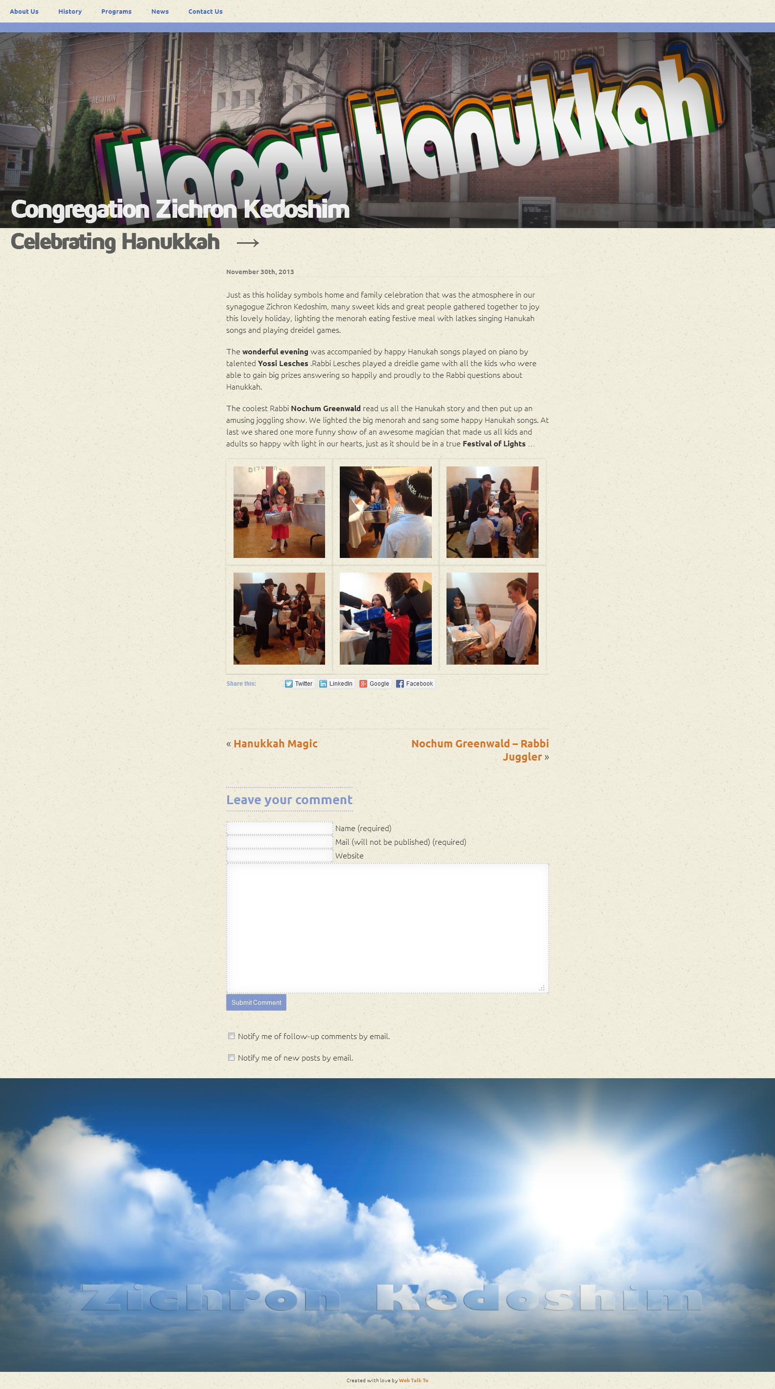
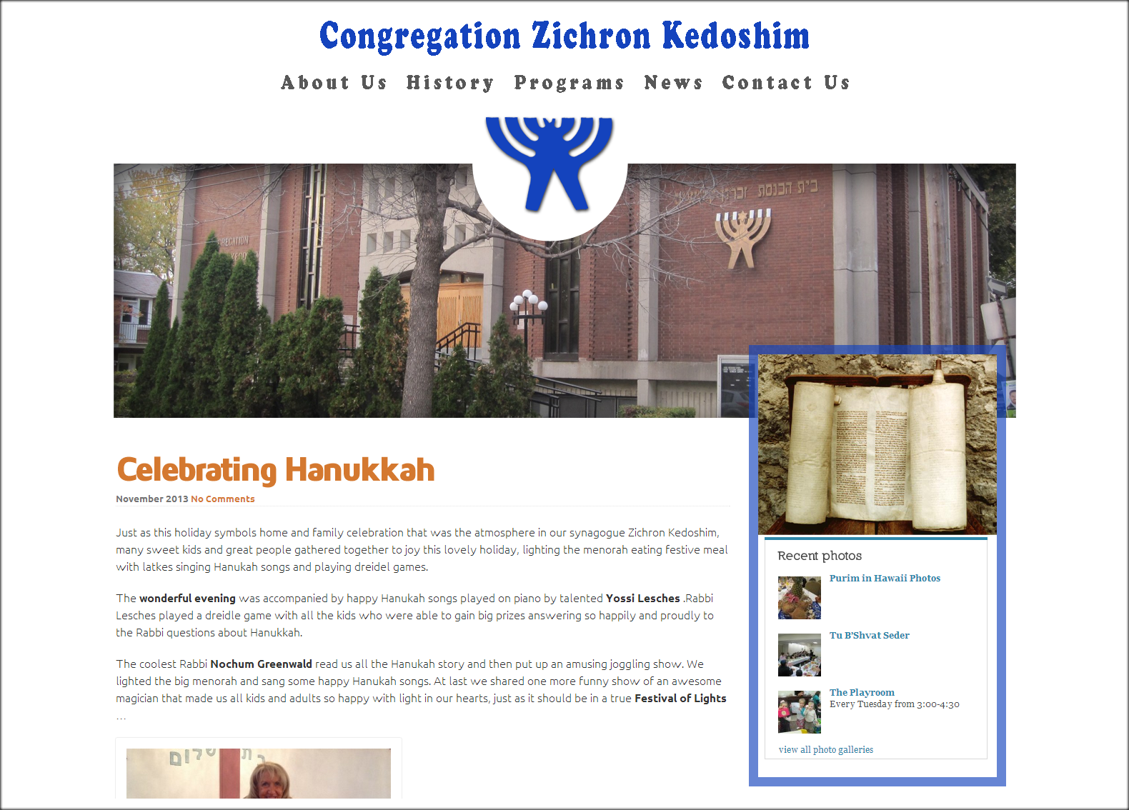
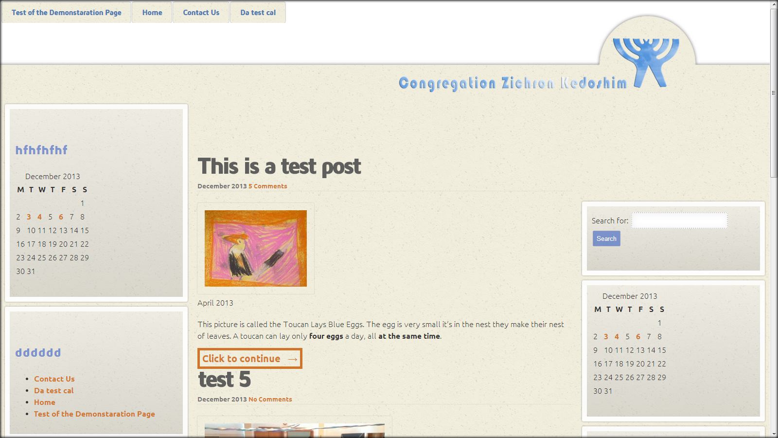
Couple month ego I created a website for Zichron Kedoshim congregation (read about first version of site design). At that time I have received information to fill up just few pages. It is very hard to build something when you have too little info you can operate with.
Mostly because of not enough info I got, I decided to use large, stretched from left to right image of the congregation house on top of the page and big image on the bottom. I should say that I really liked the ideas i used to create the first version of the site. Now I am missing a bit the CSS3 and JavaScript animation affects I created for the first site version and stop using them in subsequent site versions.
Screenshot of the first site design version
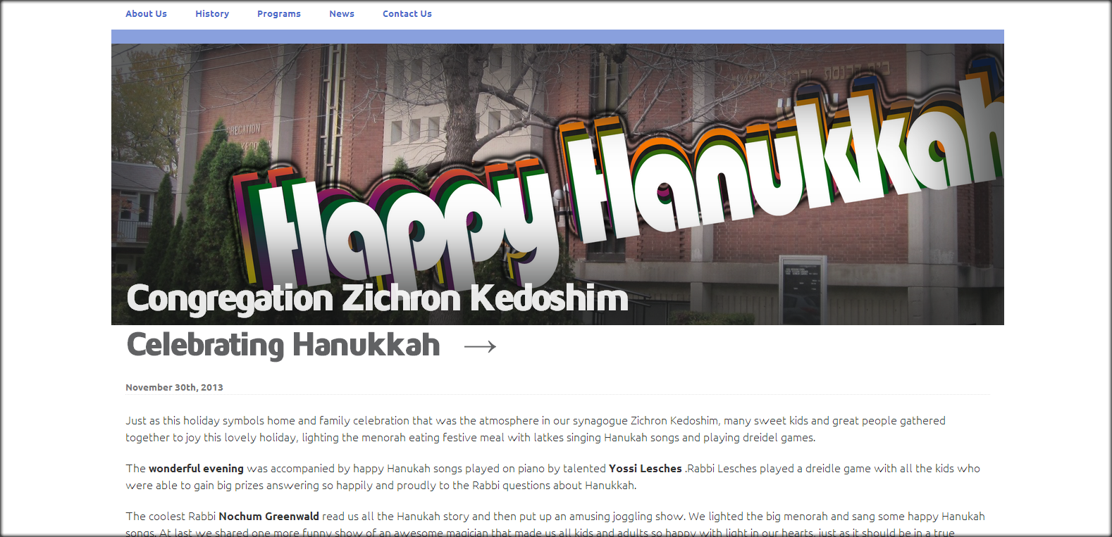
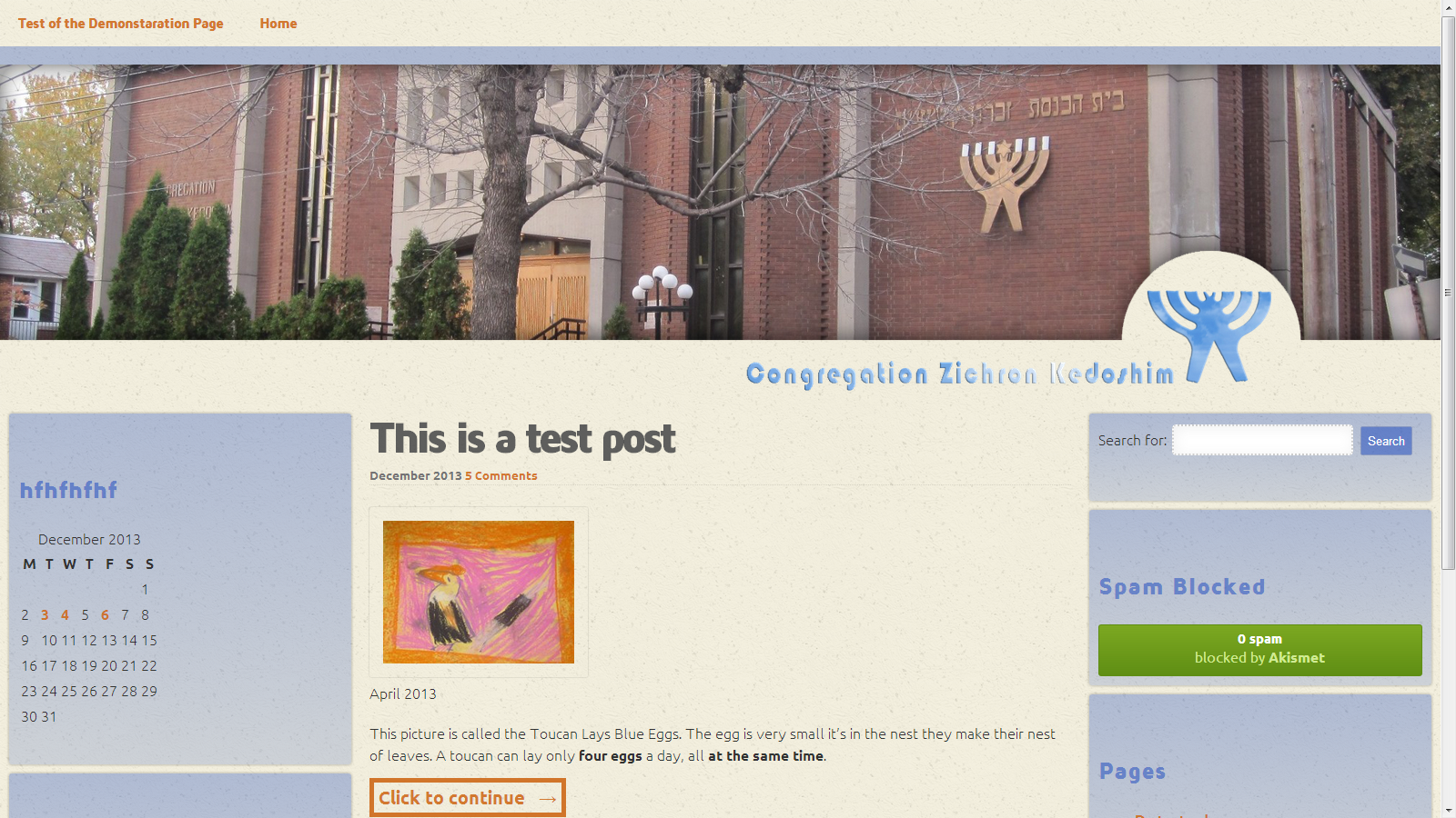
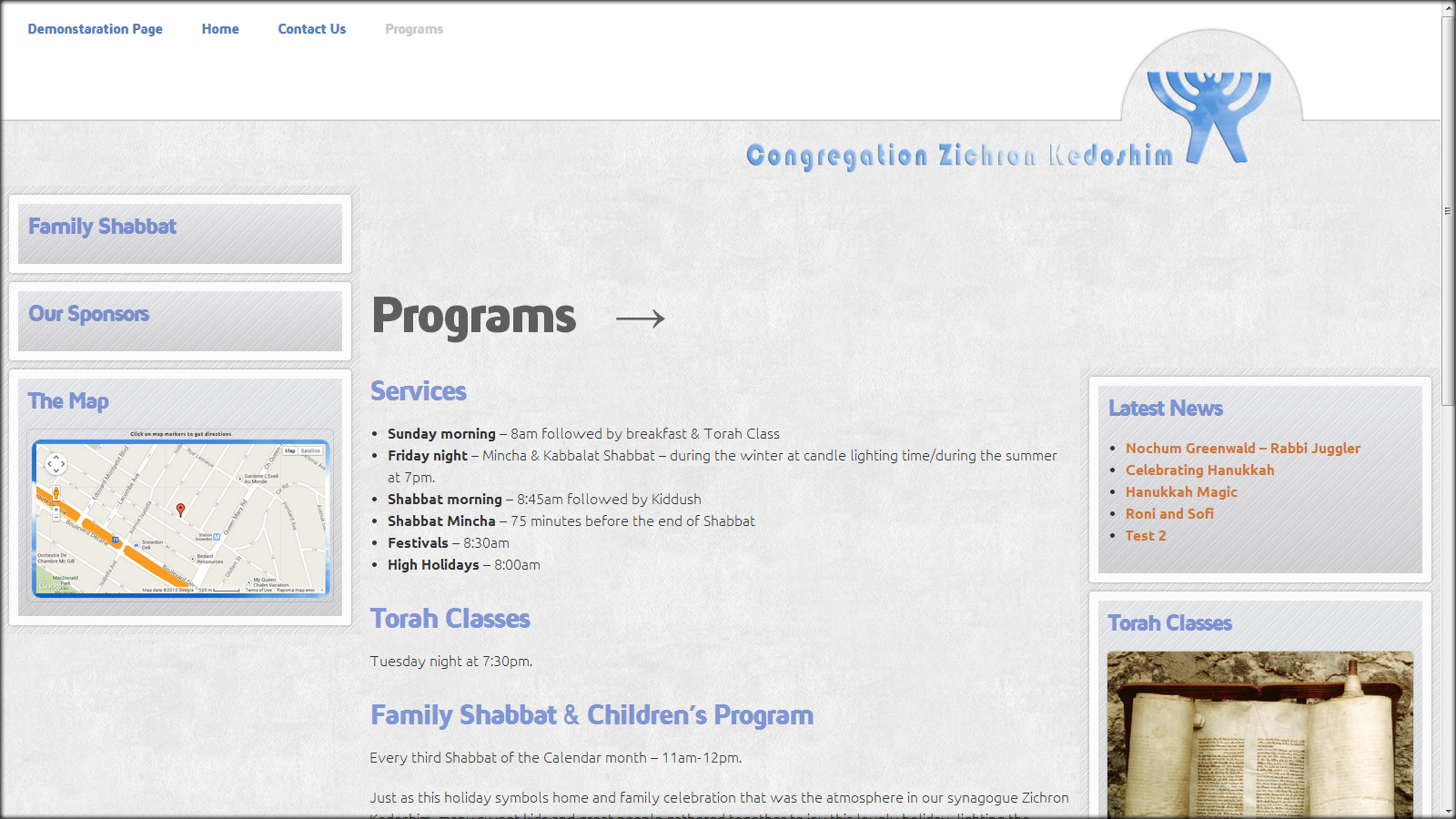
Anyway, one day I started to feel unsatisfied about the design, especially after some of the pages filed up with content. I asked my self – is it right? That congregation site looks like Blog? The answer was – not!
First I tried to save the situation by changing dimensions of the layout design.
It did not really work for me, so I started to search for other solutions.
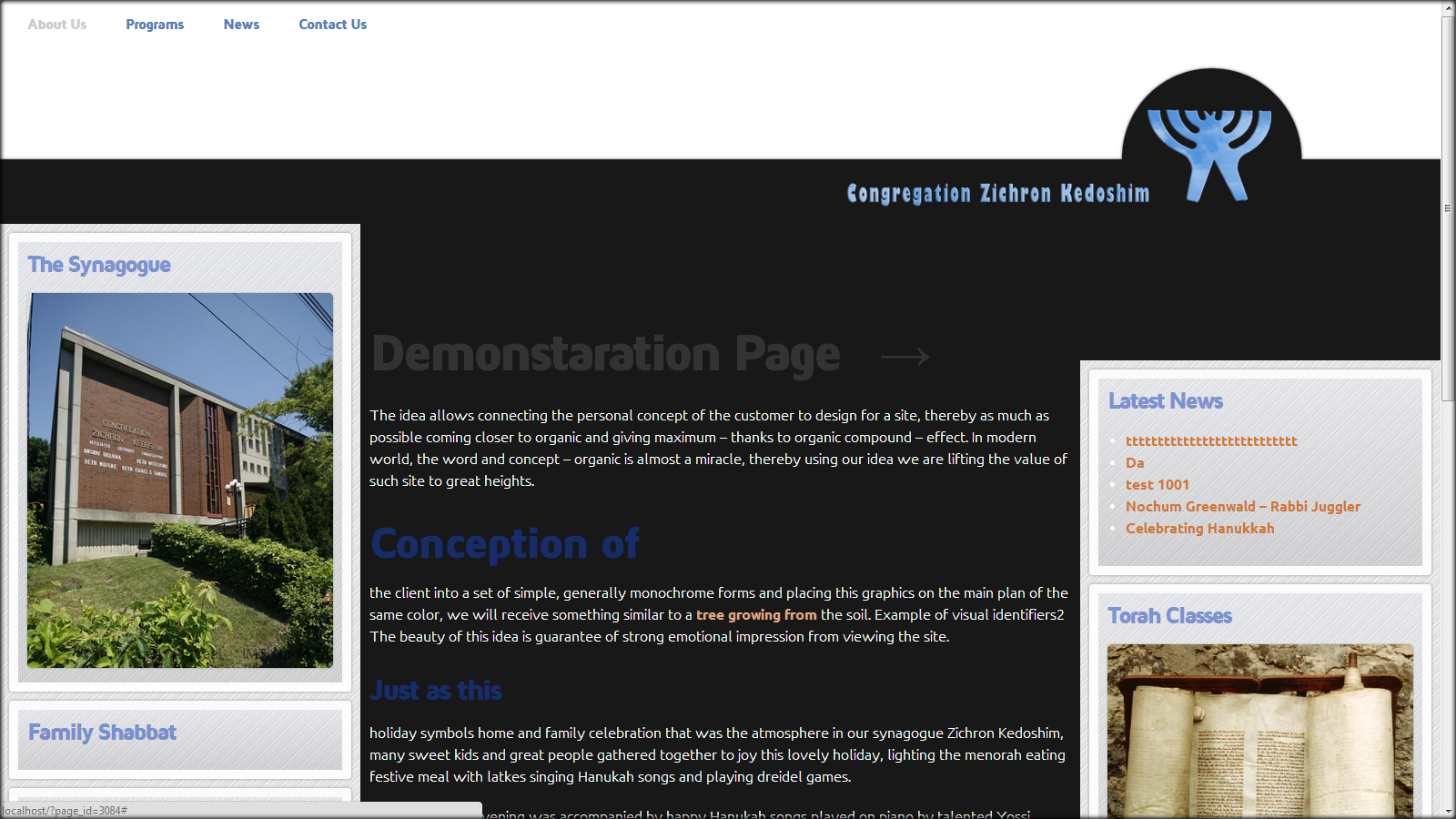
Redesign. Searching for the right feeling
This is a first sketch I made using Photoshop tools. What I was looking for is the right feeling that will match the congregation ambiance. This fast sketch looked for me much closer to the design for a synagogue website.
Fanny note:
Rabbi Lesches – when I asked for his opinion about the design – his preference was for the first design version not the new sketch design.
The Rabbi’s preferences surprised me a bit. It is why I went back to the first design and start to modify it.
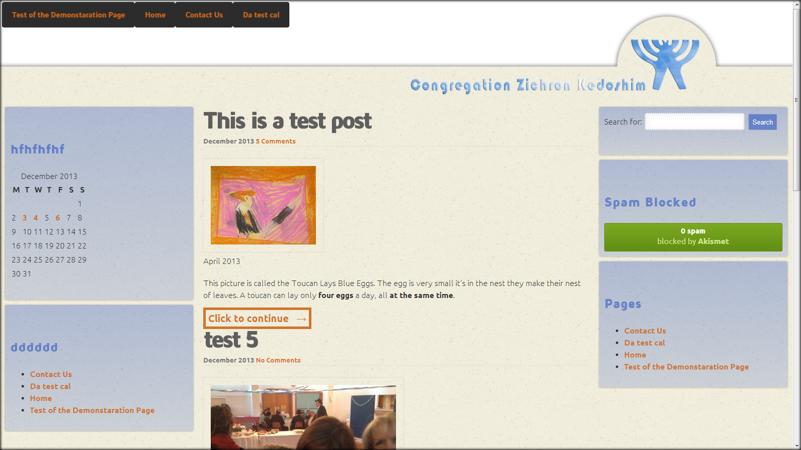
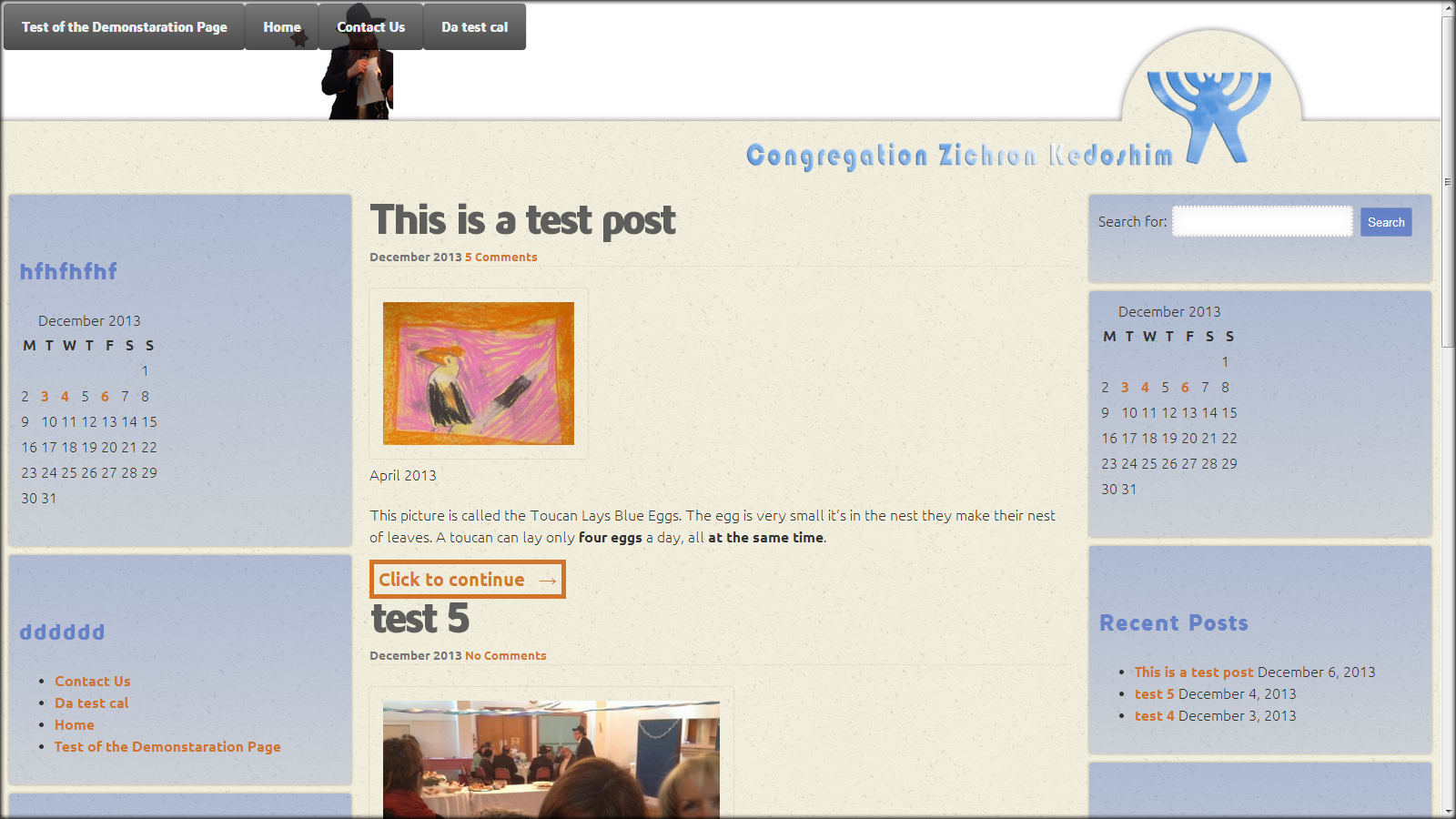
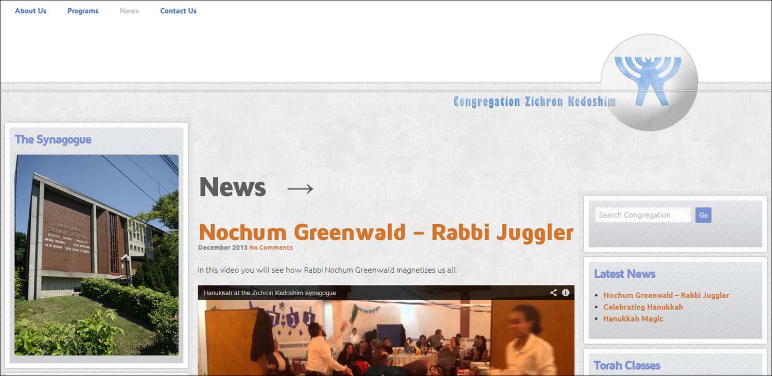
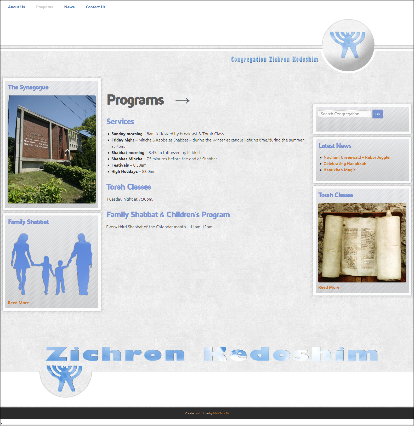
Working progress
The first site version did not have a Logo, I decided to create one. Also experiment with two side bars (left and right sections).
Cutting off the header image.
Gradient and background image for widgets – blocks of the left and right sections.
Main content on black background - test.
The final design for this point looked like this:
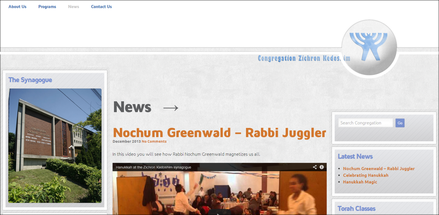
Working on Header design – Logo
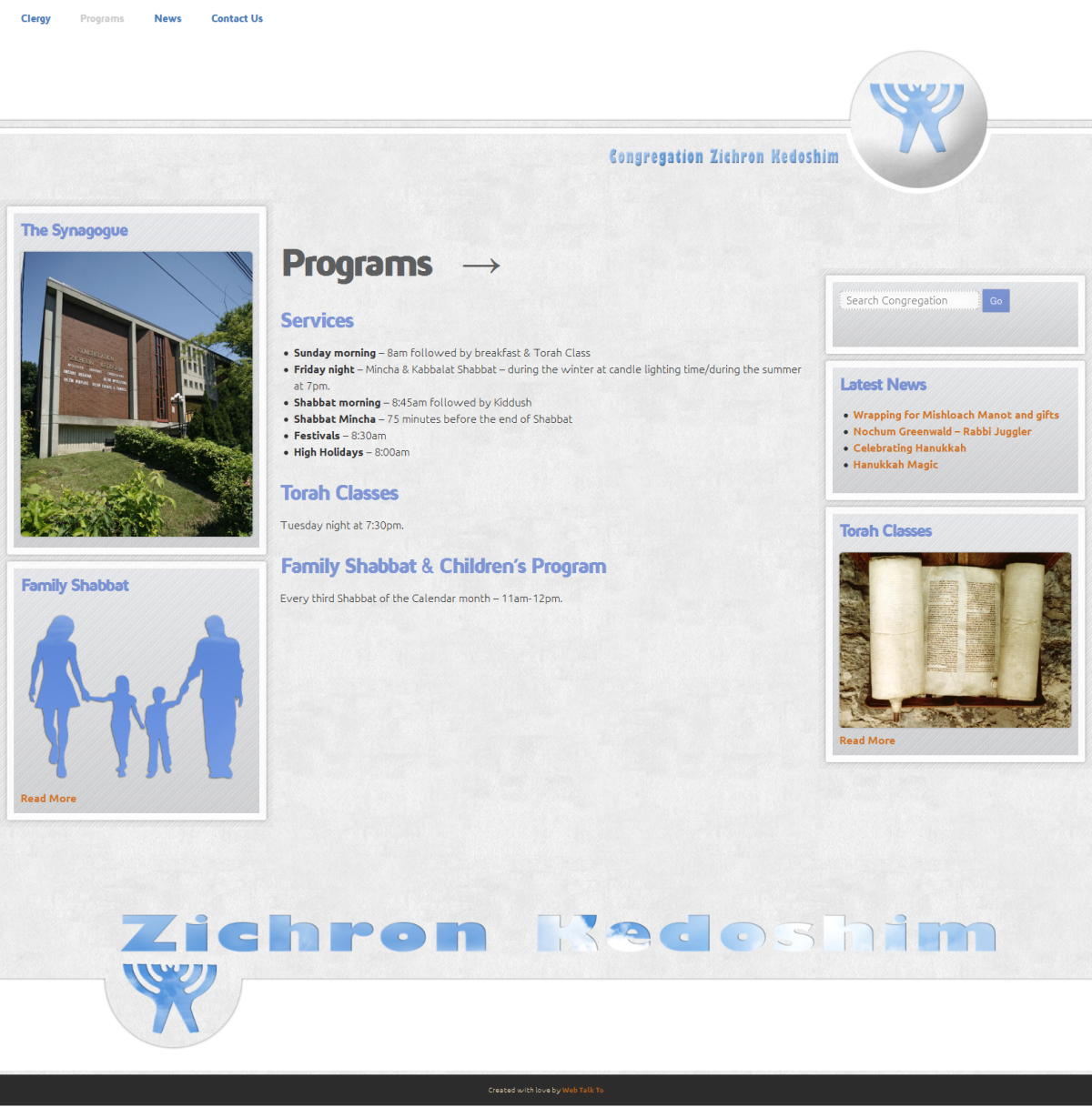
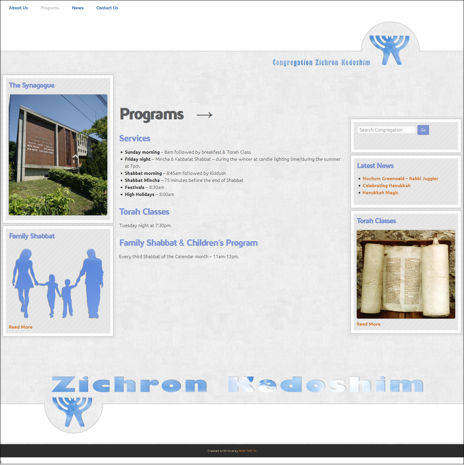
Final site design. Version two
Beautiful!
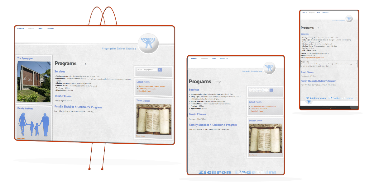
Responsive design. Monitor, tablet and phone