Cycle. Website design sample for WICC


Maxim Aginsky
accidental ꩜ initiates ꩜ serendipitous
Maxim Aginsky
Our potential client: WICC - West Island Career Center a vocational education and training centre.
One of their programs is INTERIOR DECORATING AND VISUAL DISPLAY.
For that program we wish to create a website of its own. As we are searching the existing samples of our web design portfolio, we are realizing that our amazing, wonderful and super creative website themes such as theme "Concept" or "Paul Motian Theme", has too experimental structure of sense-perceptions. Since in the case of WICC seems correct to stick to the classic web design forms of compositions, we have chosen as the basis for website our Theme No.7, which will be customized.
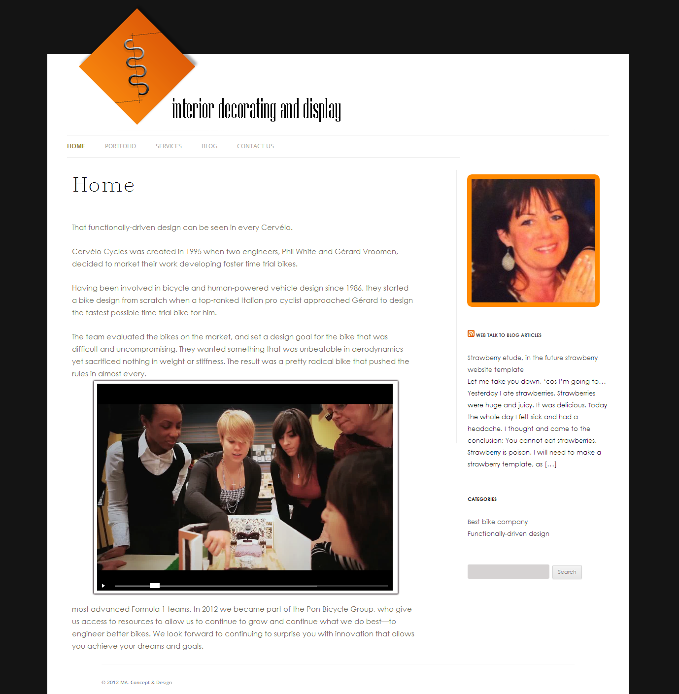
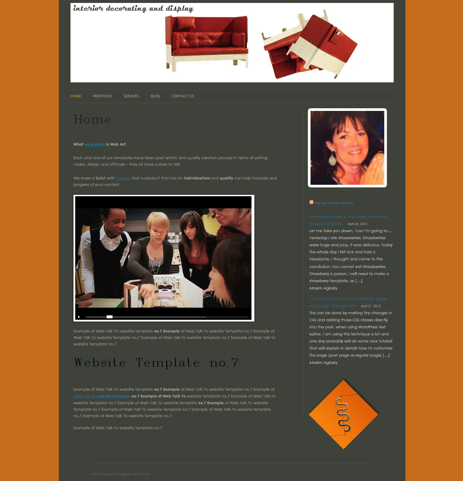
After many thoughts we have come up with this sample, as you can see the look is very clean and minimized, so that the content can blend beautifully in the page and the person that visiting the site will get the most positive impression about this program and will choose to study there.
We are very happy with the result hopefully the client will be too...
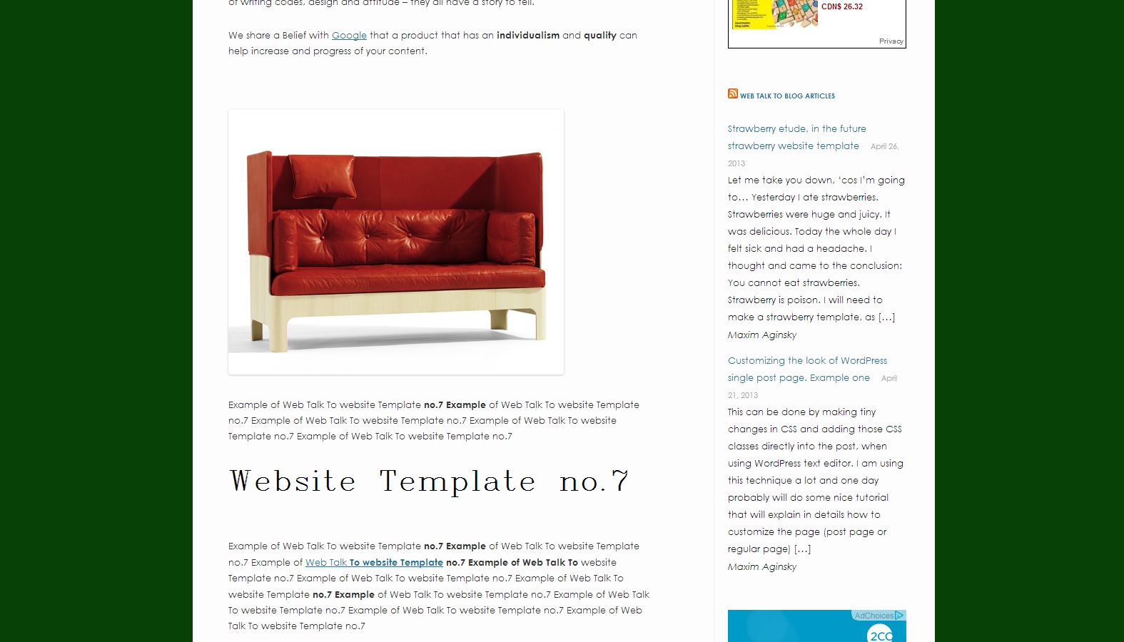
Sample one of the website for WICC.
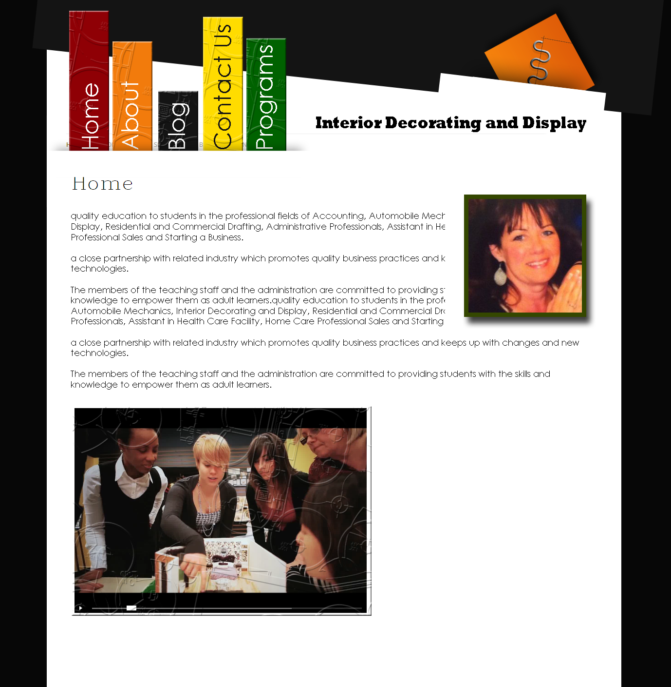
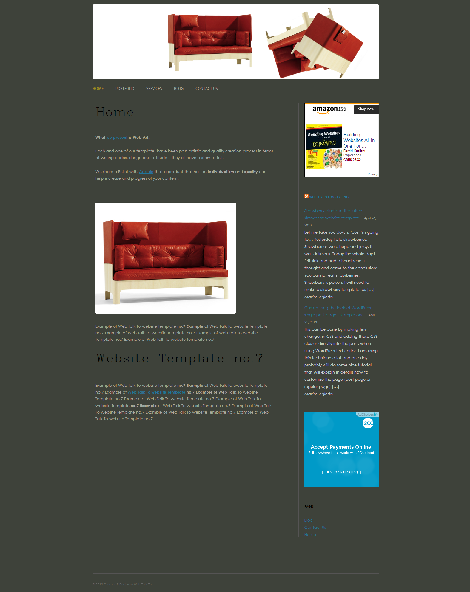
Sample two of the website for WICC.
Example of colors
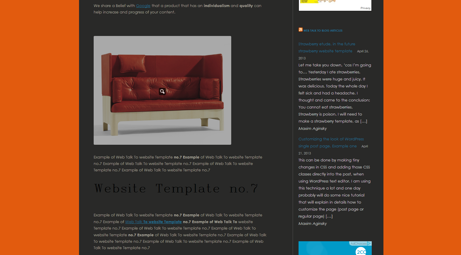
Other example of colors
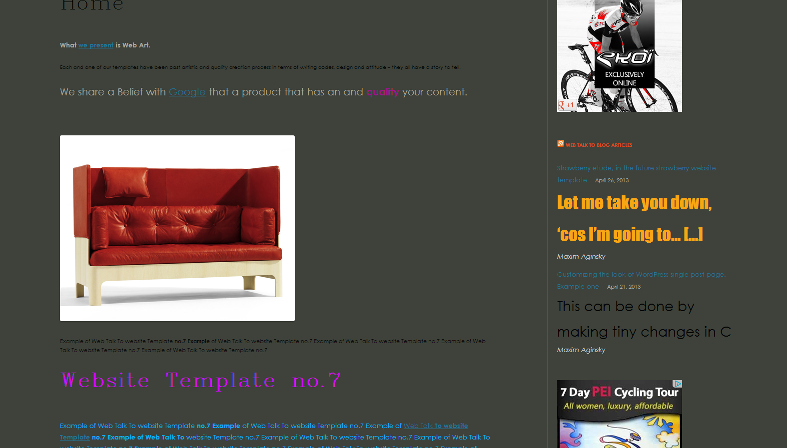
Screenshot of the Web Talk To Theme No.7
P.S.
Cycle.
Compare the samples with the original Theme no.7, we are not sure which one of them is better than the other. That is why we create another sample, that is probably the final one.
Make your own conclusions.
Final web design sample for WICC
P.S.
The impact of text styling (such as different fonts, sizes and colors) on the composition of HTML page is huge.
Example of text styling
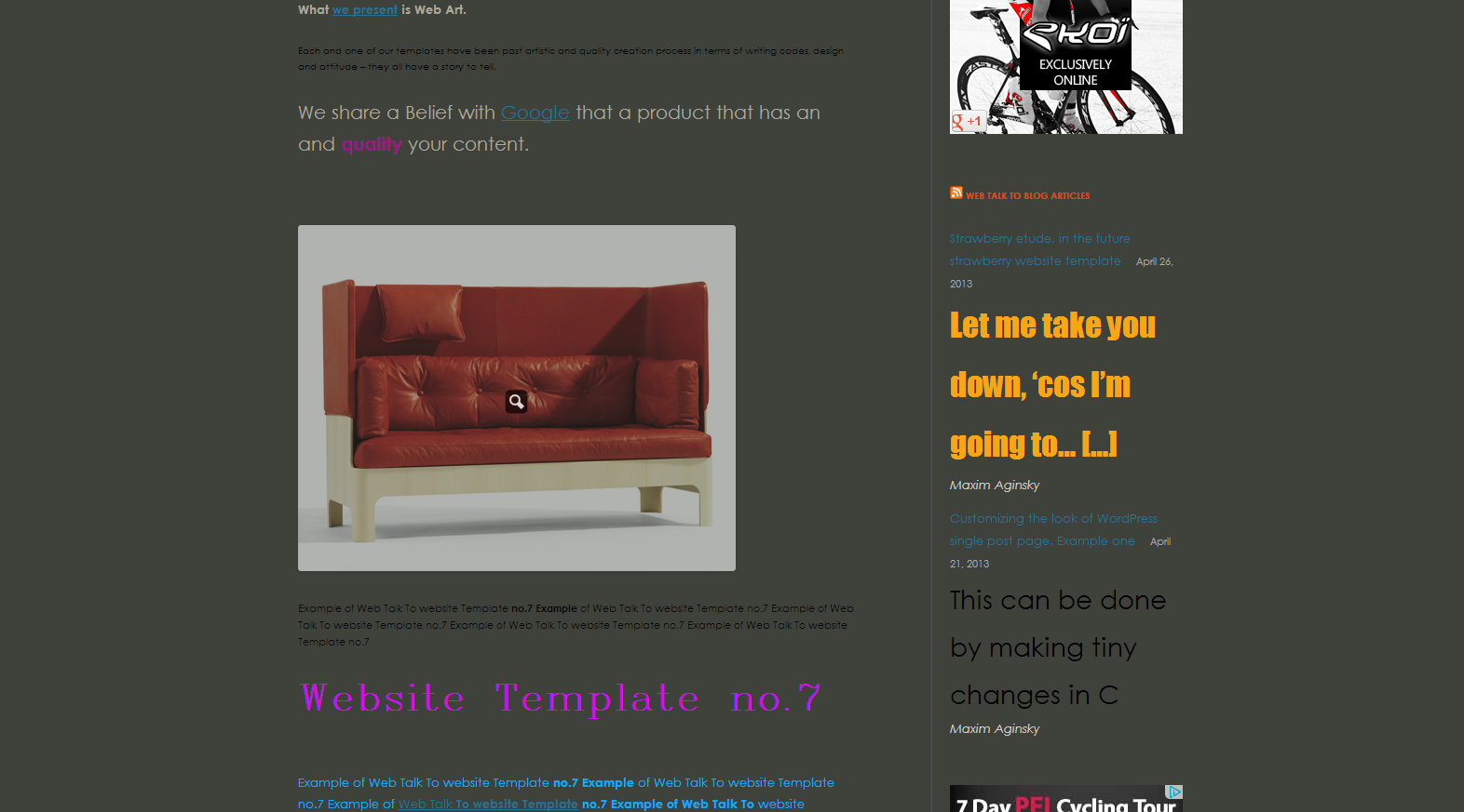
Other example of text styling
